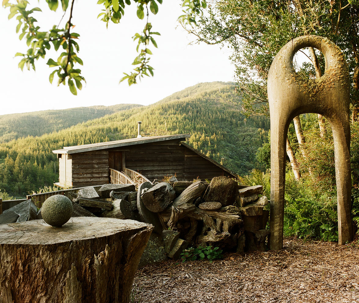
JB Blunk’s home on the Inverness Ridge with Redwood Enry Arch, 1976. Photo credit: ©LeslieWilliamson
J.B. Blunk’s art career was probably inevitable one form or another, but it was a chance encounter with Isamu Noguchi in a Tokyo craft shop that put him on course to become one of the most innovative American craftsmen of the 20th century. It was the early 1950s, and Blunk—then a soldier in the US Army, stationed in Korea—was browsing at the craft shop when he met Noguchi who was there with his wife. Yamaguchi Yoshiko. Prior to his tour in Korea, Blunk had been a student at UCLA where he became fascinated by ceramics, and Noguchi decided to introduce him to the Japanese artistic polymath Kitaoji Rosanjin, who made exquisite, rustic and colorful pottery inspired by historical Japanese ceramics, as well as lacquerware and calligraphy. Blunk apprenticed himself to Rosanjin, became a skilled potter in his own right, and later worked for artist Toyo Kaneshige, a Living National Treasure. Returning to California in 1954, he was now energized and inspired to embark on a life in which craft shaped every corner of his life. Blunk’s name isn’t synonymous with midcentury style, and he’s not a household name. (Yet.) But with exhibitions in major galleries, including Kasmin and Blum & Poe, introducing his work to new audiences, his legacy seems to be getting the second look it deserves.

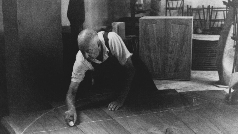
J.B. Blunk in his studio, c.1968. Courtesy: J.B. Blunk Collection

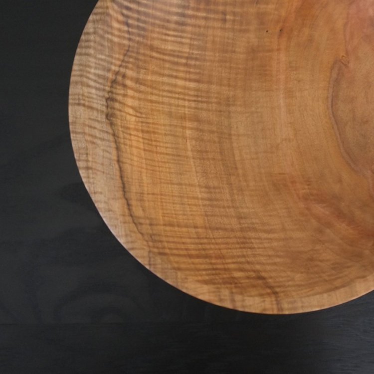
Interior of JB Blunk’s home with river stones and artworks by Blunk. Untitled painting, c.1990, and Redwood stool, c.1965.
Photo credit: ©LeslieWilliamson
J.B. Blunk (1926–2002) was born in Ottawa, Kansas, and studied physics before switching to ceramics in college. Like Wharton Esherick, Blunk was an artist who didn’t make much of a distinction between home and studio. And like George Nakashima, he found much inspiration in the natural structure of wood—its knots, grain, colors, and textures. Blunk settled in the town of Inverness in the mid-1950s, and decided to build a cabin there himself. Now known as the Blunk House, the home was described in T Magazine as “a cottage from a midcentury-modern fairytale.” There’s a potter’s studio with three kilns, and a woodshop. Maria Nielson, Blunk’s daughter, and the author of a book on Blunk’s work, spends time at the house, where her father made everything from the sleeping loft to the ceramics in the kitchen by hand.
Woven into the fabric of the landscape and the house itself is redwood. The table in Blunk’s kitchen is crafted from a gigantic slab of redwood, and they dot the mountainous landscape of Inverness as far as the eye can see. Blunk was active in a variety of media, including clay and cast bronze, but his primary medium was wood. Sometimes a chainsaw was part of the picture. Blunk’s favored wood species was redwood, though he occasionally used cypress. Redwood’s characteristic color and natural softness gives it working properties that are almost clay-like. Blunk would salvage chunks of redwood on the landscape that had been discarded by loggers, and make use of his findings in the ways that best suited their scale. Using his chainsaw, he’d carve chairs out of single pieces of wood, sometimes creating “seating sculptures” that seemed to hover somewhere between sculpture and furniture. According to Mariah Nielson, even the bathroom sink in the Blunk House bears chisel marks.

Interior of JB Blunk’s home with artworks by Blunk, sofa by Max Frommeld, and cushions by Christine Nielson and Nancy Waite Harlow.
Photo credit: ©LeslieWilliamson
From his time studying ceramics in Japan, Blunk was steeped in the aesthetic and philosophical principle of wabi sabi, which is difficult to translate precisely, but in an artistic context means accepting transience and imperfection, finding beauty in it, and not trying to “fix” anything about an object. Wabi sabi had a powerful influence on both historical Japanese crafts and on mingei, the Japanese craft revival movement that emerged there in response to industrialization in the 1930s, and was several decades underway when Blunk visited Tokyo.
A wabi sabi approach to craft could mean embracing asymmetry, or a nick or a scratch, or a perceived flaw in a piece of wood—like a discarded burl of no interest to commercial loggers. Blunk took the lesson of his craft training and applied it to working with reclaimed wood. Natural “flaws” became centerpieces, and odd shapes were just another form of inspiration. A major work entitled “The Planet,” completed in 1969, can be viewed at the Oakland Museum of California. It’s made from a single, the enormous root structure of a redwood—the only remains of a long-dead tree. It was typical of Blunk to salvage something that others had overlooked, and to create from it something unique, odd, and beautiful, that seemed at once ancient and modern. Perfection isn’t easy. But imperfection, at its best, is even harder to achieve. It seems safe to say that J.B. Blunk nailed it.


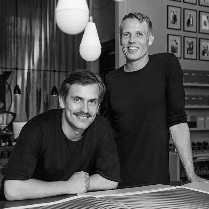


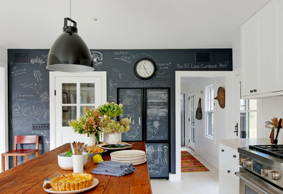


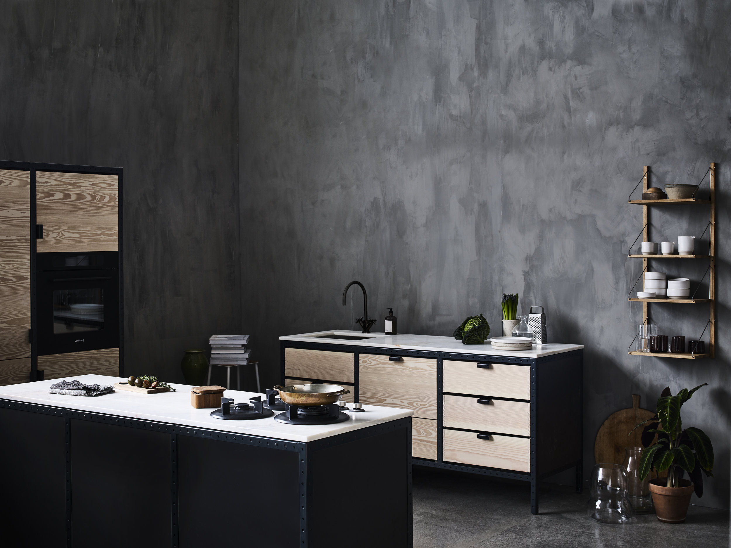


![Hudson Company Select Harvest White Oak [Barley Finish].](https://images.squarespace-cdn.com/content/v1/544e3a5ce4b0117bc5e24e56/1478024195545-DCX9R2VG17FAKFCVE4UT/Select%2BHarvest%2BWhite%2BOak%2BNew%2BFace%2BBarley%2BOil%2BCharacter%2B7.jpg)
![Custom mood board by Frama Copenhagen. Wood background is Hudson Company Select Harvest White Oak [Barley Finish].](https://images.squarespace-cdn.com/content/v1/544e3a5ce4b0117bc5e24e56/1476806056243-06V1ZDK7OICULFHKT5NK/image-asset.jpeg)