Event Stage For Field + Supply 2017

FRONT ROW.jpg
BACK STAGE.jpg

The Hudson Company + Field + Supply 2017

Over the past few months, we had the pleasure of collaborating with designer Brad Ford to craft the event stage for the 4th annual Field + Supply, which took place at The Hutton Brickyards in Kingston, NY from October 6-8. 

Over the Columbus Day weekend, the Field + Supply event stage played host to a number of talented artists, including: Brooklyn Bluegrass Collective, Cricket Tell The Weather, and The Bones of JR Jones among others. You can see the full list of performers here. 

This year's stage was being built with Reclaimed Mushroom Wood paneling. Our Reclaimed Mushroom Wood paneling is sourced from the bedding bins of mushroom growing facilities in the mid-Atlantic. The material offers a caramel patina and a combination of smooth and radial kerfed faces.

Interested in stage or installation design? Click here to see our 2016 stage for Field + Supply. 

Special thanks to Cabinets by Stanley and designer Brad Ford.

Stage photos by Alex Nawrocky.

HERO STAGE.jpg
STAGE MAIN.jpg
Stage Side.jpg
STAGE DETAIL.jpg

Inspired By: Plethora Magazine

Plethora_Magazine_Issue_5_side_1.jpg
 
 
We wanted to highlight the natural beauty and tactility of print by using a format that allowed the craftsmanship to shine trough on an excessive level. Ultimately, we created this kind of otherworldly giant…an object that no one would know exactly what to do with.
'Anima Mundi:' the latest issues of large format (70cm by 50cm), bi-annual Plethora Magazine, created and published by  Peter Steffensen and Benjamin Wernery.

'Anima Mundi:' the latest issues of large format (70cm by 50cm), bi-annual Plethora Magazine, created and published by  Peter Steffensen and Benjamin Wernery.

8.jpg
35.jpg
_MG_5174.jpg

An otherworldly Giant

Plethora Magazine is an independent, biannual publication founded in Copenhagen which challenges the bounds of the conventional magazine format — conceptually as well as physically (each page has poster dimensions, 50cm x 70cm). 

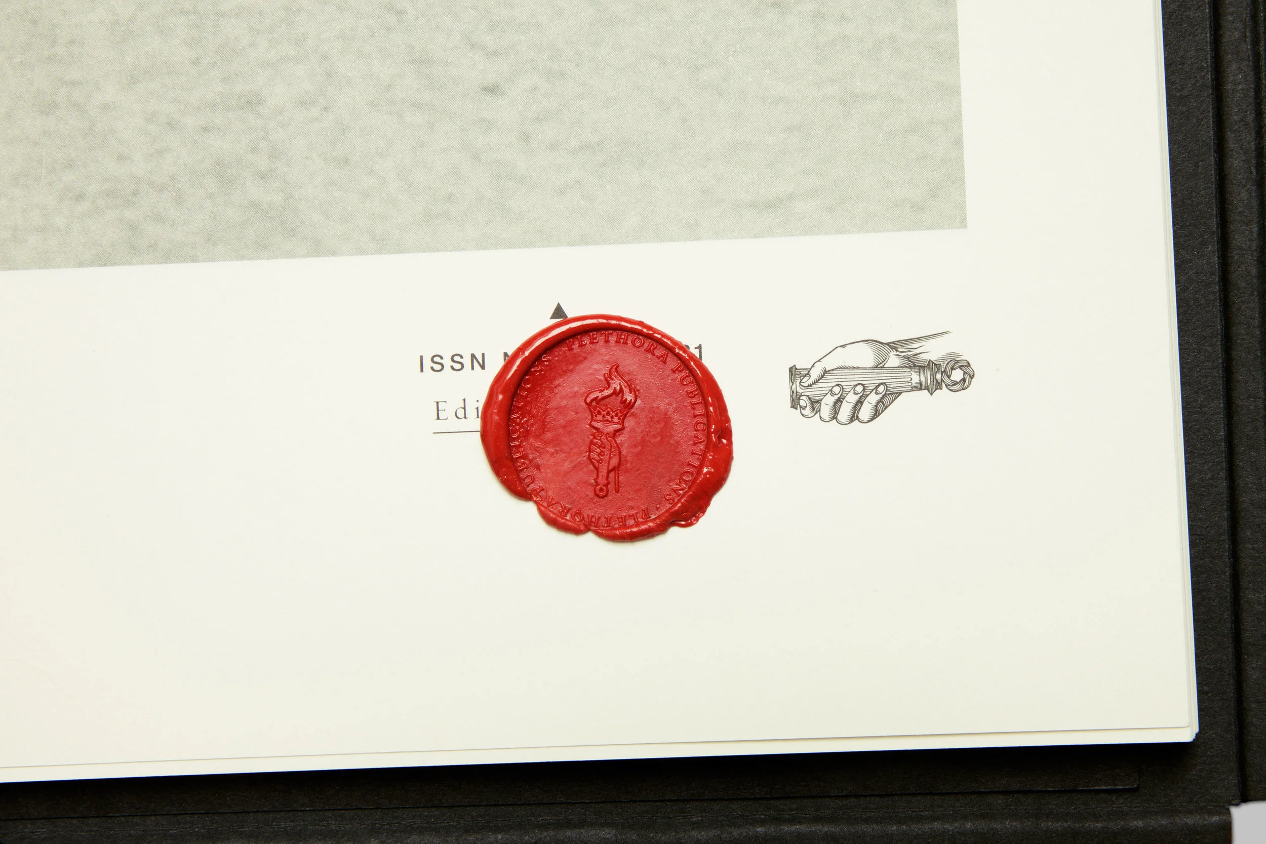
Skillfully printed by the monks of a Hindu temple, Plethora Magazine is unlike any other magazine on the planet: no noise, no ads and no logos, just 52 pages of poster-size visual indulgence and tales from the life less ordinary, presented in a careful blend of quirky archive material, wondrous art prints and contemporary artist features.

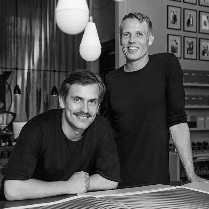
What inspires us most about Plethora, is how editor Peter Steffensen and art director Benjamin Wernery are curating such a fascinating variety of content - much of it reclaimed from historical ideas, technology, and imagery - to make something entirely new. 

Here are the highlights from our conversation with Peter Steffensen.

First off, tell us about the creative / professional journey that led you to Plethora?

I come from a background in philosophy and so, in  many ways, Plethora is a natural bridge for me between the academic world and the art scene. With Plethora, we are trying to shift the boundaries between the two fields and create a new context for both, essentially blurring the lines between fiction, myth, and science - which I think is an essential aspect of art. 

Was there one main idea that led to creating an oversized magazine now, in the digital age?

Yes, in fact. As you probably know, not that long ago, most magazines published a digital version to supplement their print publication. But now, that relationship has been been inverted. So, the aim for us was to turn all the inherent and presumed 'flaws of print' upside down and then amplify and refine them to a degree were they became attributes, specifically those qualities that are impossible to digitize.

Basically, we wanted to highlight the natural beauty and tactility of print by using a format that allowed the craftsmanship to shine trough on an excessive level. Ultimately, we created this kind of otherworldly giant…an object that no one would know exactly what to do with.

Why did you believe that bigger was better?

Well, we wanted to craft a very particular reading experience. The magazine's size naturally slows down the consumption of content.  Plethora Magazine is designed to actively involve the body so as to change the way we experience the content and then, hopefully, open up a space for reflection.

What we've observed is that the magazine's size does, in fact,  help people to both slow down and become quieter as they flip through and examine the pages - which is one of the hardest things for any of us to achieve these days.

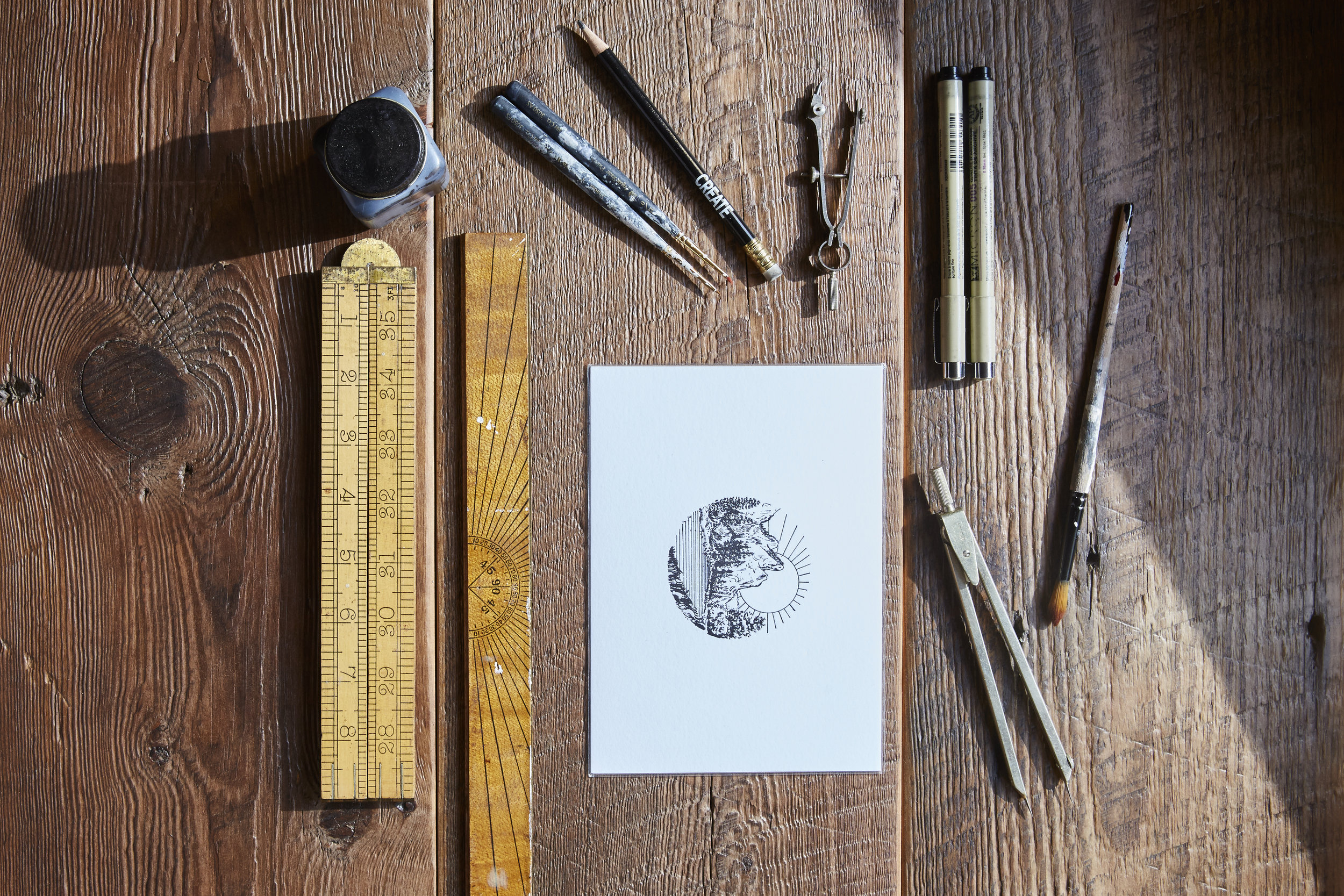
Without giving away any trade secrets, what can you tell us about the printing process?

We are fortunate to work with very skillful printers here in Denmark called Narayana Ashrama Press, which is both a Hindu temple and a high end off-set printers. It’s truly a wonderful place and so, when we print, we actually move in and stay at their guest house during the whole process. This lends a much needed air on calm to an otherwise decision-intensive and hectic process. Don’t think we could make Plethora anywhere else.

what would you say is the 'red thread' that connects the themes of all six issues of Plethora to date? 

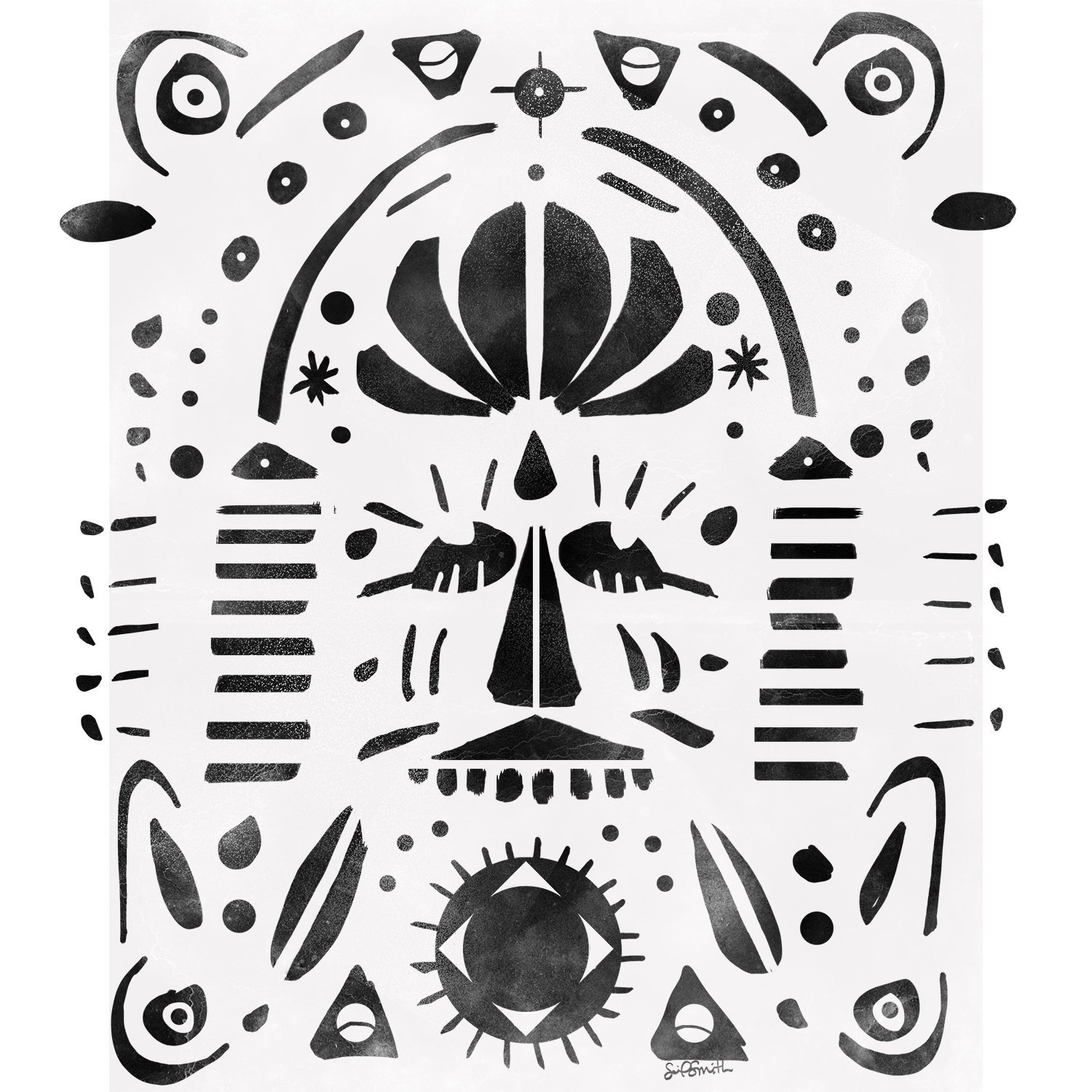
We work from a vast and ever-evolving archive of images and subject matter that we have compiled over the years (the crossroads between art and science is definitely a preferred territory for us). And these items make up the reservoir from which we can shape and slowly built a theme for each issue. Honestly,  the themes for some  editions can be years in the making. 

Ultimately, the trick is to create subtle intersections between a variety of narratives in order to bring about the element of wonder, which is essential to Plethora.  We want to create a experience where layers of meaning are endlessly unfolding, so there are new connections being made each time you open an issue. 

What's been the biggest challenge in bringing Plethora out into the world?

Almost from day one we’ve had to carve out our own niche within the world of magazine distribution. Also because it’s such a hybrid between a curated print collection, an object d’art, and a conventional magazine. So seeking out the appropriate platforms and outlets for the magazine has probably been the biggest challenge.

Do you have a favorite feature from the first six issue of Plethora?

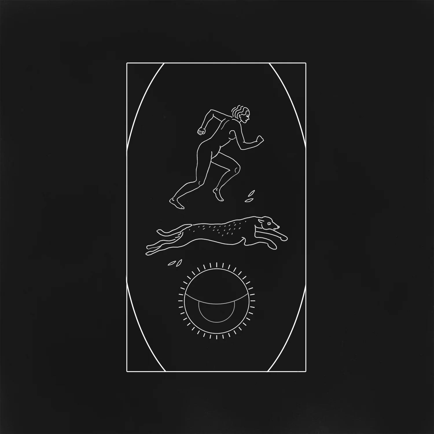
Once in a while we manage to stumble on a real gem. And if I was to pick one out of the lot, it would probably have to be the feature on the Selknam tribe of Terra del Fuego (also called the Hain people), from our first issue (see below).

During the long preparation for issue one, we ran across these amazing black and white images of a now extinct tribal culture. They were all wearing these strange tribal masks and their bodies were totally painted and they were standing out in the snow. The whole scene was like something out of a strange and grotesque avant-garde theater productions. 

When we researched the Hain we discovered an incredible and elaborate mythology behind the initiation ritual - more complex than any greek tragedy. 

As it turned out the image we found were taken by a German priest and anthropologist who visited Patagonia in 1923 and who happened to witness and document,  the last ever initiation rite of the Selknam tribe. The entire tribe were murdered by settlers not long after the priest's visit.

So this story just had it all - fierce drama, mystery, forgotten meaning, archetypical signs and symbols - an ancient, universal narrative somehow. Working with this story really helped set the tone and standard for how we choose our features ever since.

What can you tell us about the impact Plethora is having around the world?

Only when an issue of Plethora is exhibited and unfolded in three dimensional space, can the potential of the magazine truly comes across, and the quality of the print can be best appreciated. 

So, from the very beginning we have prioritized traveling exhibitions abroad to show the diversity of our editions and to create experiences for a foreign audience that would have a real impact. And it gives us the opportunity to meet with our collectors in person, which I think is very important for our kind of product.

How would you say that ideas and artifacts, of the past inspire you to create and innovate?

I really appreciate the different traditional crafts that we encounter on our journeys. Especially in Asia, where the artisans have a very different approach to time and craft than we have here in Scandinavia. All in all, I like most esoteric things drenched in mystery and symbols. And much of the work we do on Plethora Magazine is actually one long semiotic journey to extract the meaning behind these.

So, for now, I definitely feel that I'm in the right line of work.

Learn more and shop at www.plethoramag.com

The Selknam tribe of Terra del Fuego from the first issue of Plethora Magazine.

The Selknam tribe of Terra del Fuego from the first issue of Plethora Magazine.

Peter Steffensen, Editor In Chief (pictured at right) and Art Director  Benjamin Wernery of Plethora Magazine.

Peter Steffensen, Editor In Chief (pictured at right) and Art Director  Benjamin Wernery of Plethora Magazine.

The aim for us was to turn all the inherent and presumed ‘flaws of print’ upside down and then amplify and refine them to a degree were they became attributes, specifically those qualities that are impossible to digitize.
— Editor-In-Chief, Peter Steffensen
Plethora_Magazine_Issue_6_SWARM_01-kopier.jpg
19.jpg

Inspired By: Selina van der Geest of NL-GB

SEVAN029 (1).jpg
SEVAN015 (1).jpg
The Reclaimed Brown Board Paneling we used on the outside of our house immediately adds a sense of history and character.
— Selina van der Geest
Selina van der Geest of NL-GB, photo by Venetia Dearden

Selina van der Geest of NL-GB, photo by Venetia Dearden

Introducing Selina van der Geest

Interior designer Selina van der Geest moved to New York from London in 2000. Since coming to America, Selina has worked in the art and decorating business and has now opened her own eclectic showroom near Millbrook, NY, 90 miles north of New York City.

After building her own house in Milan, New York, Selina was inundated with requests to add her unique style and organizational skills to projects for private clients. It has been a natural progression to continue the decorating business she started back in England, bringing a relaxed European feeling to her clients’ houses. She believes in working organically, reflecting in her designs and colors, the natural surroundings of the property she is transforming.

Earlier this year, we sat down with Selina to discuss her work.

Tell us a bit about how your time training in Europe prepared you for the work you do today?

Well, I studied history and art history which gave me a great background for my work in interior design.  I was lucky to combine both fields working for Colnaghi, the old master art gallery in London, designing stands and galleries as well as working with important art works. It was there that I learned woodworking and curtain making, thus giving me a very hands on approach to my work. The European aesthetic is different and has certainly continues to influence my work here in the States.

How did you choose Upstate, New York as the base for your home and business?  

My husband, who is Dutch, bought a house Upstate in 1983, when he first came to America.  I moved to New York from London in 2000 and since I share his love for the area, we purchased land in 2002 and decided to build a house. As soon as we finished the house, I was asked to help with other projects and so my work Upstate evolved.

what is the red thread that connects all of your design interests?

I am very inspired by nature and the environment around me, whether Upstate or on my travels. I often  incorporate natural elements into my designs.  Bottom line, I strive to create original homes and furniture for my clients and that's what drives me creatively.

What can you tell us about the design process for your own home in Milan, NY?

Before even buying the land, we bought an early 17th Century Louis XIII mantle in Bordeaux, France when we were there for a wedding.  Then, we designed the house around this and a pair of antique Chinese doors.  Coming from homes built of stone in England, I wanted to achieve the same sense of history and character in our new home Milan.

The Reclaimed Brown Board Paneling we used on the outside of our house, immediately adds a sense of history and character.  I stained the cut edge of all the batons, so we didn’t have fresh cuts showing.  It also has the advantage of requiring less maintenance.

Inside we have a large open room featuring Reclaimed Hudson Company Beams, which, along with the Bordeaux mantlepiece, give a very European character to the house.  On the floors we used wide white oak boards, which we left untreated so they could develop a patina over time.  The result is a home which feels very settled, relaxed and natural.

What were some of the key design goals for your new home?

We love cooking so wanted to have a big open space that would allow us to cook while also enjoying the fire and the living area.  You enter through a mudroom with the large Chinese doors creating a welcoming opening into the great room and a view through the French doors to the pool beyond. We often have our family and guests staying and having separate bedroom wings and a guest apartment help to give us all space, but a wonderful place to congregate.

We built the house in seven months and it was certainly an advantage to be on site daily. I spent many days shoveling snow or helping the framer when someone didn’t show up and nothing was delayed waiting for decisions.  I also insist on a clean and tidy job site, believing that a messy environment encourages sloppy work.

What's next for Selina van der Geest?

I am working on a new house being built in Sharon, CT for a client whose apartment I designed in the city. We’re combining a traditional stone farmhouse with painted barn buildings, a stone potting shed and an English green house. The goal is for the house to feel as if it’s been there for hundreds of years and has evolved over time.  Likewise, my goal is for the interior is to feel as if it’s been collected over the years, with interesting accents, textures and natural colors.

Lastly, how would you describe your experience working with The Hudson Company?

The Hudson Company have a wonderful selection of materials and a great aesthetic. From the sampling process to selection, they have listened and understood what we are after. Whether its a small order of individual planks and beams or a bigger order of  pre-finished wood floors, The Hudson Company has  always provided us with quality, professional services.

Visit NLGB.com to learn more about Selina's work.

Learn more about Reclaimed Hand Hewn Beams here and Reclaimed Brown Board Paneling here.

Below is a sampling of more interiors by Selina, with photos by Jane Beiles for The New York Times.

unnamed (8).jpg
unnamed (5).jpg
The Hudson Company have a wonderful selection of materials and a great aesthetic. From the sampling process to selection, they have listened and understood what we are after.
— selina van der geest
unnamed (3).jpg

The Hudson Company + Camp Wandawega Sneak Peak

camp+photo+6.jpg
Screen-Shot-2016-10-03-at-7.32.48-AM.png

Reclaimed Softwood Threshing Floors at Camp Wandawega, Wisconsin

Camp Wandawega, located near Elkhorn, Wisconsin and established in 1925, is a place quiet unlike any other in America: an historic landmark, a vintage summer camp, and (among other things) a former brothel and speakeasy! Today Camp Wandawega has been lovingly preserved by its owners / innkeepers David and Tereasa, who have reinvented Camp Wandawega while simultaneously preserving it's fascinating legacy and beloved character.

The newest project at Camp Wandawega is the restoration of the property's 'Social House' which will feature Hudson Company Reclaimed Softwood Threshing Floor

A bit about Reclaimed Softwood Threshing Floors: Threshing is the agrarian process in which wheat is separated from chafe. Traditionally, farmers have used oxen and cattle to tread repeatedly over the crop to accelerate the separation. The result of this aggressive agricultural process is, that the wide mixed, softwood floor boards of the threshing room floor develop a distinct, rugged character and well-worn patina.

Below is a sneak peak of the Reclaimed Threshing Floors being installed in Camp Wandawega's Social House. More on this project to come in the near future!

More about Camp Wandawega here.

More about Reclaimed Softwood Threshing Floors here.

See our 'Designer Square Series' interview and collaboration with Camp Wandawega innkeeper and stylist extraordinaire Tereasa Surratt here

The Camp Wandawega Social House nearing completion, summer 2017.

The Camp Wandawega Social House nearing completion, summer 2017.

Reclaimed Softwood Threshing floors just after being installed at Camp Wandawega.

Reclaimed Softwood Threshing floors just after being installed at Camp Wandawega.

IMG_1053.jpg
Installation photos courtesy of Camp Wandawega.

Installation photos courtesy of Camp Wandawega.

UpdatedExterior.jpg

The Hudson Co. Featured on Architizer.com

1502728897319mill-0888.jpg

The Hudson Company on Architizer.com

Thanks to Sydney Franklin and the entire team at Architizer.com for featuring us on their site this month. Their profile of The Hudson Company - Good Wood: The Epic Journey of Reclaimed Timber Flooring is a fantastic overview of the people, products, and process that make The Hudson Company who we are.

Here's an excerpt:

"With a few exceptions, no single architectural project is entirely made of building-products sourced from the same place. It takes a village of manufacturers — all working in conjunction with architects, engineers and contractors — to compose a proper shelter for us to inhabit. Everything from the exterior cladding and the roof to the window hinges and the kitchen countertops are hand-selected from around the world and chosen for their performance and aesthetic quality. The same goes for something as seemingly simple as flooring: As an interior structural element that heavily contributes to the experiential qualities of a space, it’s imperative that architects choose the most appropriate material to go beneath our feet.

This is where wood comes in. We all know what bad wood flooring looks like, but truly great wood flooring is an instant turn-on. It’s sexy. It’s clean. It has a level of depth and texture that fake wood flooring, ceramic tiles and even concrete can’t inherently produce. It’s all-natural and cuts to our core. Each individual plank features a distinct pattern and porosity that can’t be precisely reproduced in the plank next to it."

Read the full story here. 

1502728893601mill-0497.jpg

Our New Manhattan Showroom | Opening February 1, 2017

A work in progress: The Hudson Company's new Manhattan Showroom, opening Feb 1.

A work in progress: The Hudson Company's new Manhattan Showroom, opening Feb 1.

The Hudson Company Comes to Manhattan!

We are thrilled to formally announce the opening of The Hudson Company's new Manhattan Showroom on February 1, 2017. In just a matter of weeks, this new showroom space (designed by our friend Brad Ford), will be open to clients, partners, designers, architects, and the general public alike.

We look forward to welcoming you to our new space at 5 East 20th Street very soon. More showroom news and images to follow in the coming days.

Stay tuned to Instagram, Facebook, and this blog for the latest news.

Work in progress at the new Hudson Company Manhattan Showroom.

Work in progress at the new Hudson Company Manhattan Showroom.

IMG_3357.jpg
IMG_3347 (1).jpg

The Hudson Company + Ashley Seil Smith

New York based artist Ashley Seil Smith

New York based artist Ashley Seil Smith

I like the warmth and texture inherent in the Reclaimed Heart Pine flooring, there’s a lot of character and line variation within the grain, which I think complements the line work in my drawings.
— Ashley Seil Smith
The artist at work.

The artist at work.

The Hudson Company + Ashley Seil Smith

Ashley Seil Smith is an artist based in Manhattan, New York with a studio in the lower Hudson Valley.  She has a background in cultural anthropology but earned an MFA in Illustration as Visual Essay from the School of Visual Arts.  In 2012 she cofounded The Period Store and eventually sold it in 2015 to focus on editorial illustration, fine art, and teaching. Ashley's commercial clients include Google, Case Agency, Forbes, Oyster Books, Isthmus, and various academic journals and nonprofits. The artist lives, and often works, in Manhattan, but escapes to the Hudson River and her studio near Bear Mountain whenever she can. In addition to freelance, commissioned, and fine art work, Ashley teaches art to a variety of ages around Manhattan with Scribble Art Workshop.

The Hudson Company first discovered Ashley's work via her inspiring Instagram feed which is, like her work, full of whimsical observations of both the natural and built environments. It would be easy to peruse Ashley's work - particularly her pen and ink drawings and ethnographic prints - and see it as simplistic. But we think that it is precisely this deceptive simplicity that is so intriguing about Ashley's work. In our opinion, there is a timeless, reflective beauty in her (often small scale) drawings as well as an exotic mystique to her prints and graphic design work.

This summer we reached out to Ashley and asked her to allow us into her creative process. Along with the insights below, Ashley was also kind enough to create a custom mood board for us, using Reclaimed Heart Pine [Original Face] as her backdrop. 

5 Questions with Artist Ashley Seil Smith

Tell us about the tools that you've included in your mood board, what's their origin story? 

I enjoy collecting older tools that can actually be used in my art practice.  Some of them were picked up at antique stores across the United States (particularly along the Hudson River Valley, where my studio is), others I inherited from my grandma, who dabbled in art and was a wildly creative person.  A lot of older tools were designed beautifully, simply, and with quality material, so using them is an esthetic and practical as well.  My rulers are my favorite tools - natural material with interesting designs and stories to tell.

How do you use mood boards in your work? What role do they play in your creative process?

Mood boards keep things concise - I believe "good" mood boards have some parameters - a limit on how much you can add, so it forces you to think through what really inspires you and why.  So much of creativity is about making decisions, and a mood board helps you identify specific things you like or aim for in your own work.

I always keep a small collection of images on a folder in my desktop, and these act as a general mood board for my work, which spans across many mediums.  They are images that I truly love and that inspire me in some way, whether it's the color palette, technique, concept, or the way the image makes me feel.  I go through my little desktop mood board about once a month and always end up editing something out and adding other things that I like better.

There are so many places to go for inspiration these days, where do you go to get inspired?

I like going to places that set my aesthetic standard pretty high, and since I live in Manhattan, I have the opportunity to visit museums fairly often - the Met, MoMA, or Museum of Natural History are some favorites.  If an art exhibit inspires me I always buy the exhibit catalogue, so I have a nice collection of art books started and I refer to them when I'm in a rut.

Other than museums, I also turn to creative sources I trust, like The Great Discontent, and I see a lot of wonderful work on Instagram and Pinterest.  Pinterest, in particular, is great when I'm doing initial research for a project.  And, like many artists, I find a great deal of inspiration in nature. If I'm not working, I'm likely walking outside with my dogs or out for a trail run or hike around Inwood Hill Park.

What can you tell us about the drawing you included in your mood board: was that an original for this mood board or something you created separately? 

This particular ink drawing was done at the beginning of the year and was inspired by Yosemite National Park. I find myself drawing a lot of scenes from places I love or that inspire me. As you can tell, I enjoy the simplicity of pen and ink as well, it's a simple medium that's good for travel, so a lot of my ink drawings are done on location.

Why did you chose this particular Hudson Company flooring as the background for mood board?

I like the warmth and texture inherent in the Reclaimed Heart Pine flooring, there's a lot of character and line variation within the grain, which I think complements the line work in my drawings. I'm a big fan of Hudson Company flooring - you manage to cover all parts of the spectrum, from rustic to modern to classic and beyond.  Natural textures paired with modern design inspire me, which is one of the reasons I started following Hudson Company on various social medium platforms. 

You can learn more about Ashley's work on her website and you can follow her creative journey on Instagram. All above photos are taken from Ashley's website or Instagram feed. All mood board photos by Gentl and Hyers

Learn more about Reclaimed Heart Pine [Original Face] here. 

Mood board by Ashley Seil Smith for The Hudson Company

Mood board by Ashley Seil Smith for The Hudson Company

INSPIRED BY: FURNITURE DESIGNER ASHER ISRAELOW

The Ø Chair by Asher Israelow

The Ø Chair by Asher Israelow

Serving trays, black walnut and brass.

Serving trays, black walnut and brass.

Handcrafted Furniture for the 'Modern Explorer'

One of the best things about participating in national design fairs is the exposure we get to talented designers and makers. One of these such craftsmen is Brooklyn-based furniture designer Asher Israelow, whose work is featured as a part of the FAIR showroom collection, curated by interior designer Brad Ford. Israelow's design studio produces all original and small batch furniture pieces designed to last for generations.

And it goes without saying, that the more familiar we get with Asher's work, the more inspired we are. As a graduate of Rhode Island School of Design (RISD), with degrees in art and architecture, Israelow incorporates a strong architectural aesthetic into his creations. In his chairs and tables, there is a kind of clear structural strength as well as a streamlined elegance. His pieces are never 'heavy' and, yet, they carry weight. According to his own website, each piece of Israelow's work, "narrates the story of its materials, creating innovative and precise designs with a timeless aesthetic." We totally agree; there is a definite timelessness to these pieces - they could be just as at home in a 21st-century Manhattan penthouse as they would be in a mid 20th-century Danish hotel designed by Arne Jacobsen

Another element of the designer's work that we admire is how he sources the material for his furniture, "all the materials [we use] are ethically and locally sourced, building upon the importance of origins." And, on top of all this, we love to see makers like Asher taking advantage of the many beautiful varieties of walnut in their work - which is one of our favorite species. With such a thoughtful ethos toward timelessness, durability, and sustainability in mind, it's not hard to see why The Hudson Company is quickly becoming big fans of Asher's stylish furniture.

You can learn more about the designer and his work by visiting his website and by following Asher on Instagram.

All photos from www.asherisraelow.com.

The 'Miner Table' in maple

The 'Miner Table' in maple

The 'Contour Bed'

The 'Contour Bed'

Anamorphic Console in walnut and brass

Anamorphic Console in walnut and brass

Chairs from 'The Lincoln Collection'

Chairs from 'The Lincoln Collection'

'Dante Table' in walnut

'Dante Table' in walnut

Asher Israelow

Asher Israelow

Detail from 'Serenade Series' table

Detail from 'Serenade Series' table

All photos from www.asherisraelow.com.

The Hudson Company + FAIR at Collective Design Fair 2016

FAIR Showroom, NYC.

FAIR Showroom, NYC.

The FAIR exhibit space at Collective Design Fair 2016.

The FAIR exhibit space at Collective Design Fair 2016.

the right balance of artistry and thoughtfulness

The designer behind FAIR is New Yorker Brad Ford

Back in October, 2014, Ford organized a modern makers craft fair in upstate New York called Field + Supply. The focus of that fair was on modern, elevated craftsmanship showcasing artisans from the Hudson Valley area as well as makers who work in New York City and Brooklyn. FAIR is an extension of that concept and is now a permanent showroom at the New York Design Center. It is more edited and elevated than the original event upstate, but the focus remains on high-end, handcrafted design and craft. Many of the same designers who showed their work at Field + Supply are represented at FAIR and several of them are craftspeople that Ford has worked with over the years on his own high-end design projects.

With FAIR, Ford's emphasis is on the people behind the products, “I have established relationships with a lot of these artists and know how beautifully executed their workmanship is. They have the right balance of artistry and thoughtfulness so there’s a timelessness to their work which I think has a lot of value. For me, their work should be considered future heirlooms that will last for generations.”

THE HUDSON COMPANY & FAIR

Whether he is collecting bespoke furniture, lighting, textiles, or ceramic objects for the FAIR showroom, Ford's has established an aesthetic that fits well with The Hudson Company's own design values.

So, we were proud to collaborate with Brad for this year's Collective Design Fair in NYC. As a part of FAIR's exhibit space at CDF, Ford incorporated Hudson Company Select Harvest White Oak [French Cut, Bare Finish] flooring, as a contrast to the glossy white concrete of the event space flooring.The end result was an exhibit space that felt warm, clean, welcoming, and modern - all adjectives that clearly describe what FAIR is all about. 

Click here to learn more about Hudson Company Select Harvest White Oak [French Cut, Bare Finish] or contact us for a quote for your next design project. 

Hudson Company Select Harvest White Oak [French Cut, Bare Finish] floors used by designer Brad Ford at Collective Design Fair 2016.

Hudson Company Select Harvest White Oak [French Cut, Bare Finish] floors used by designer Brad Ford at Collective Design Fair 2016.

Interior design by Brad Ford.

Interior design by Brad Ford.

Designer Brad Ford.

Designer Brad Ford.

The Hudson Company + ASH NYC at Collective Design Fair 2016

Collective Design Fair 2016, VIP Lounge by ASH NYC.

Collective Design Fair 2016, VIP Lounge by ASH NYC.

The Hudson Company + ASH NYC 

Over the past five years, we've watched as ASH NYC has made a name for themselves in New York's competitive design community. In that time, ASH NYC has grown from five to twenty five team members and has gained a reputation as an innovative and bespoke urban design shop that's right at the cutting edge of what's happening today - in interior design as well as in development, staging, and furniture and object production.

This past year, The Hudson Company had the opportunity to meet up with ASH NYC and share the story behind our brand and sustainably-milled products lines. One thing led to another and, before long, ASH NYC was incorporating Hudson Co. Reclaimed Heart Pine [Chalk Finish] into one of their residential design projects. 

'OFFICE SPACE' Lounge BY ASH NYC

Not long after that, ASH NYC was asked to design a piece for the 2016 Collective Design Fair VIP lounge. From the design brief, the designers' developed a concept they called, "Office Space." Here's how they explained their final concept:

"Employing office culture as a conceptual framework for the VIP Lounge at Collective Design 2016, OfficeSpace conflates the banal - cubicles, dropped acoustic panels and ready made office furnitures with the exuberant - art and design. For moments of rest from the chaos, we would like to invite visitors to mingle and relax by the proverbial water cooler."

To help reach their overall design objectives, ASH NYC turned, once again, to The Hudson Company's Reclaimed Heart Pine [Chalk Finish] for the custom, one of a kind conference table they crafted for the VIP lounge's (see above and below).

The result of our collaboration with ASH NYC was both very satisfying and very inspiring - to see the Reclaimed Heart Pine [Chalk Finish] used for a furniture build out was such a creative contrast to how Chalk is best known, as the flooring installed at the new Whitney Museum of American Art. 

Bravo to the whole team at ASH NYC on their success at Collective Design Fair 2016. We are honored to have been a part of the process. We look forward to seeing the designs you bring to life in the years to come.

You can learn more about ASH NYC at their website and on Instagram.

Lounge space before.

Lounge space before.

After.

After.

The ASH NYC Team at Collective Design Fair 2016.

The ASH NYC Team at Collective Design Fair 2016.