Installation In Focus: Sunnyfield Farm

Sunnyfields+2.jpg
Sunnyfields Option 2.jpg
Sunnyfields 4.jpg
Sunnyfields Option 1.jpg
Sunnyfields 5.jpg
Sunnyfields 1.jpg

A Classic Home 8 Years In The Making

Overlooking the rolling hills of the Hudson Valley is the idyllic Sunnyfield Farm, a horse farm and traditional Georgian-style home in Millbrook, New York.

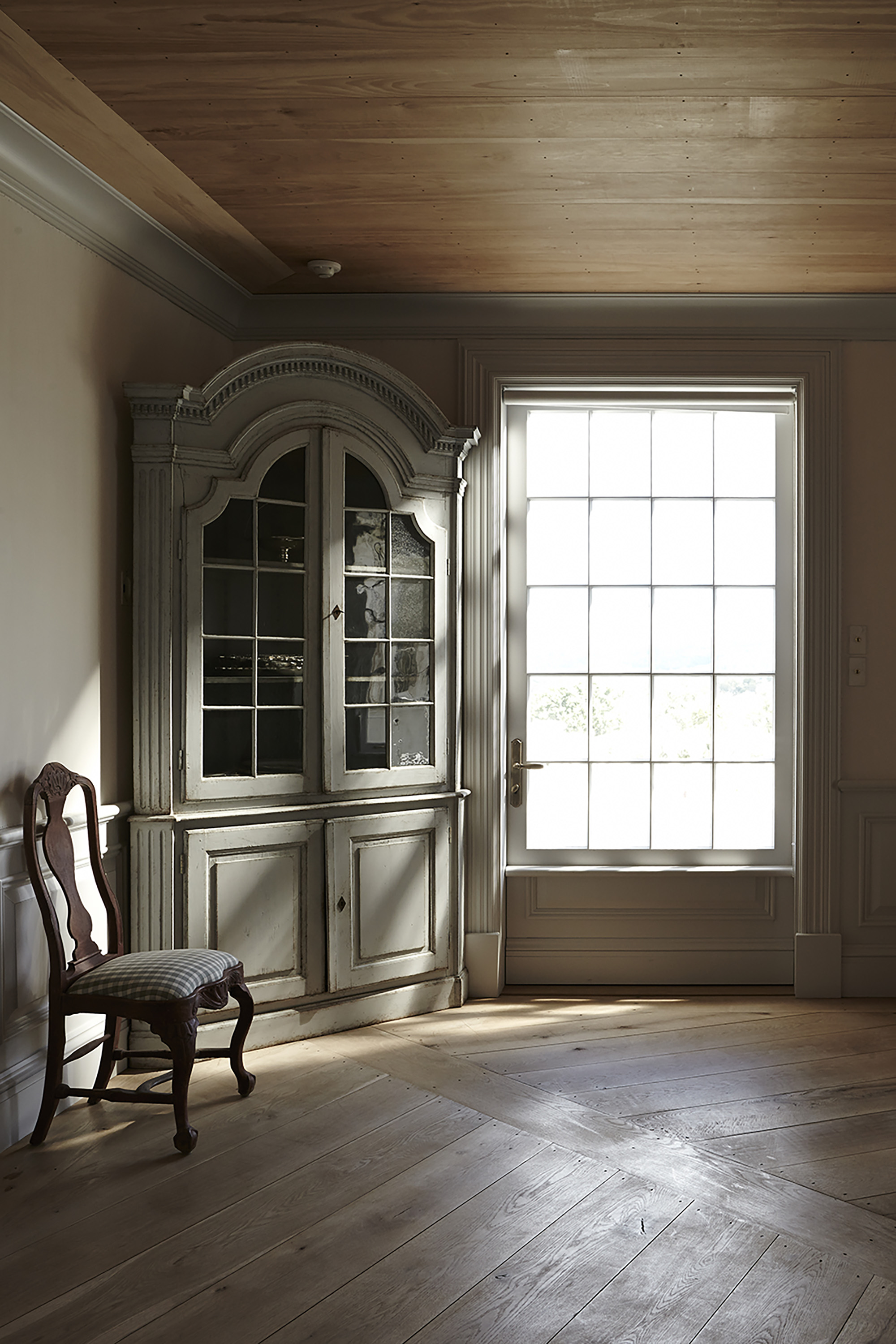
The Hudson Company was honored to play a role in the development, design, and construction of the home — a project spanning more than eight years, including a research trip to the Swedish countryside for inspiration and materials. This passion project required not only a very close client-designer relationship but also an ongoing dialogue with The Hudson Company. The result of these close partnerships is a residential installation project that features some of our most ambitious flooring details to date, including 10" Reclaimed Heart Pine flooring sourced from historic New York City townhouses; custom-milled, extra-long White Oak floor planks;  and Reclaimed Redwood specially milled for Sunnyfield’s trim work. 

Throughout the process, lead architect Cynthia Filkoff of Di Biase Filkoff Architects was attuned to her client’s high standard of quality and beauty. “We were initially asked to transform the preexisting modernist house into a traditional Tudor,” Filkoff explains, “but after living in the original house for a year, the client decided that the quality of the construction was inadequate. It made more sense to tear it down and build a new home.”

In time, the team at Di Biase Filkoff came up with a solution that would meet the client’s exacting criteria: a proper brick Georgian home with Swedish-inspired interiors connected to the magnificent land and views. In order to find the right balance of craftsmanship and aesthetic, Filkoff traveled to the client’s summer home in Fiskebäckskil, Sweden. “In Sweden, I was able to study the wood-centric, old-world architecture that the client admired so much. What I found there was an aesthetic that was rich in handcrafted details. It was inventive and playful, both inside and out. Ultimately, these were the kind of details that we worked to incorporate at Sunnyfield.”

Along with a detailed list of high-quality, sustainable material specifications, the choice of wood flooring was critical to the aesthetic and design of the home. “When it came to flooring,” Cynthia recalls, “the client was committed to creating a wood floor that reflected the antique floors of classic Swedish homes. The details had to be authentic.” From here, Di Biase Filkoff turned to The Hudson Company, who encouraged the designers to incorporate two complementary flooring types: Reclaimed Heart Pine and White Oak.

The Reclaimed Heart Pine milled for the Sunnyfield project was sourced from a row of historic townhouses on New York City’s Upper East Side and then milled to a width of 10” to reflect the flooring Filkoff had researched in Scandinavia. The White Oak flooring planks, installed in the home’s ground floor, were sourced from purpose-cut trees, hand selected from private timber stands. The trees were air-dried, kiln-dried, and custom milled to meet the architect’s designs. Along with an intricate wagon wheel pattern for Sunnyfield’s dining room, Filkoff also designated that much of the White Oak would be milled into extra-long planks that could span from the home’s front entrance all the way to the back door. At 10” wide and ranging from 10’ to 24’ in length, these extraordinarily long oak planks create a striking and unique aesthetic for the home’s ground floor. In addition, Reclaimed Redwood, sourced from decommissioned New York City rooftop water tanks, was used to outfit the home’s custom door and window frames and interior trim.

In the end, what made the Sunnyfield project such a glowing success was the sustained and passionate attention to detail by everyone involved: the client, the designers, and a wide array of talented craftspeople. Looking back, Filkoff remembers the project collaboration with special fondness. “Working with The Hudson Company exceeded our expectations on every level: from their knowledgeable insight and expertise, to their creative ideas, to their ability to source and deliver materials on time and on budget,” she says. “Throughout the project, the collaboration was exceptional. The Hudson Company enhanced the entire process. You know, I could go on and on about this project. Sunnyfield was such a labor of love.”

This installation profile originally appeared in The Hudson Company Journal, Volume 2 - click to learn more about our new print journal and catalogue.

Inspired By: Plethora Magazine

Plethora_Magazine_Issue_5_side_1.jpg
 
 
We wanted to highlight the natural beauty and tactility of print by using a format that allowed the craftsmanship to shine trough on an excessive level. Ultimately, we created this kind of otherworldly giant…an object that no one would know exactly what to do with.
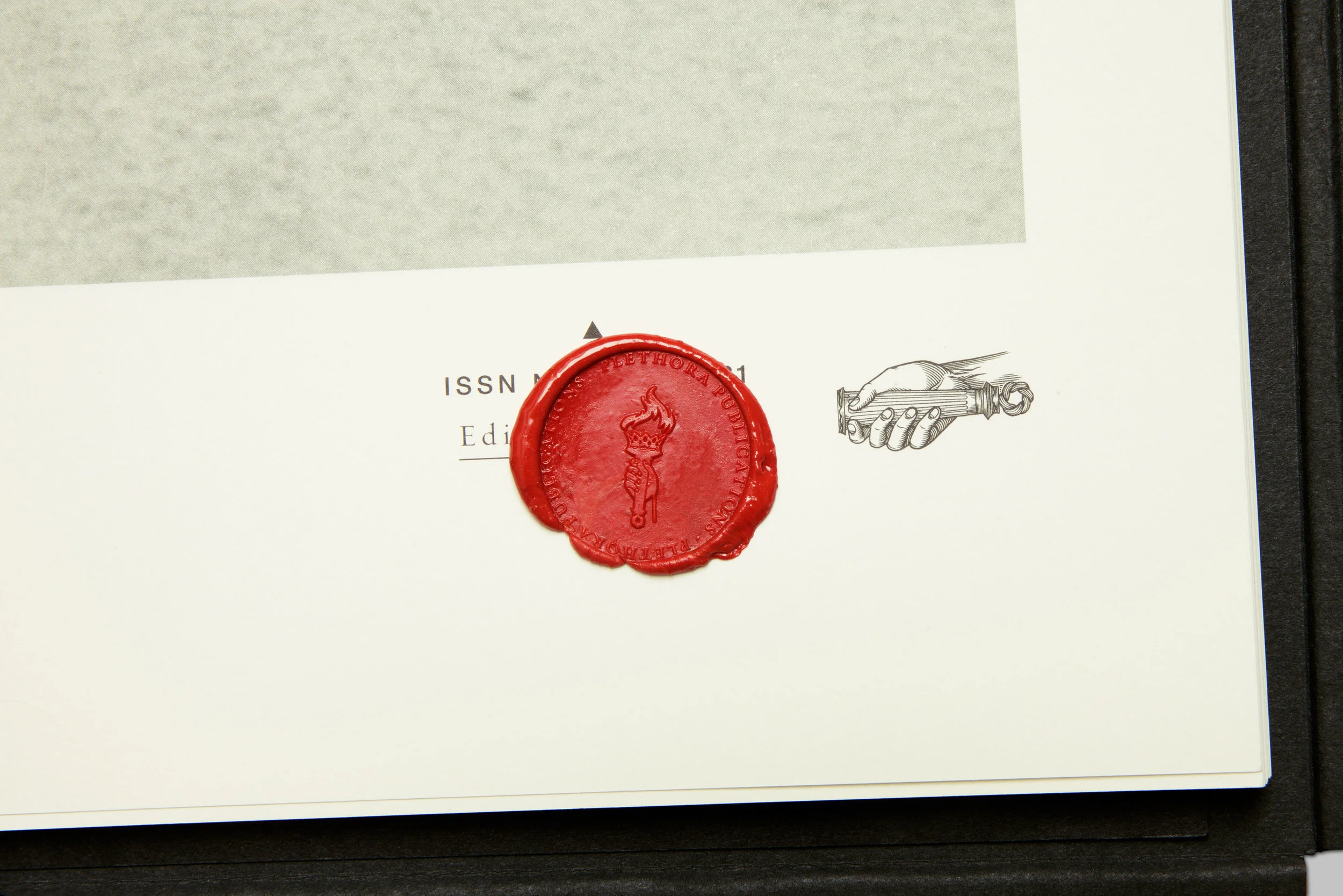
'Anima Mundi:' the latest issues of large format (70cm by 50cm), bi-annual Plethora Magazine, created and published by  Peter Steffensen and Benjamin Wernery.

'Anima Mundi:' the latest issues of large format (70cm by 50cm), bi-annual Plethora Magazine, created and published by  Peter Steffensen and Benjamin Wernery.

8.jpg
35.jpg
_MG_5174.jpg

An otherworldly Giant

Plethora Magazine is an independent, biannual publication founded in Copenhagen which challenges the bounds of the conventional magazine format — conceptually as well as physically (each page has poster dimensions, 50cm x 70cm). 

Skillfully printed by the monks of a Hindu temple, Plethora Magazine is unlike any other magazine on the planet: no noise, no ads and no logos, just 52 pages of poster-size visual indulgence and tales from the life less ordinary, presented in a careful blend of quirky archive material, wondrous art prints and contemporary artist features.

What inspires us most about Plethora, is how editor Peter Steffensen and art director Benjamin Wernery are curating such a fascinating variety of content - much of it reclaimed from historical ideas, technology, and imagery - to make something entirely new. 

Here are the highlights from our conversation with Peter Steffensen.

First off, tell us about the creative / professional journey that led you to Plethora?

I come from a background in philosophy and so, in  many ways, Plethora is a natural bridge for me between the academic world and the art scene. With Plethora, we are trying to shift the boundaries between the two fields and create a new context for both, essentially blurring the lines between fiction, myth, and science - which I think is an essential aspect of art. 

Was there one main idea that led to creating an oversized magazine now, in the digital age?

Yes, in fact. As you probably know, not that long ago, most magazines published a digital version to supplement their print publication. But now, that relationship has been been inverted. So, the aim for us was to turn all the inherent and presumed 'flaws of print' upside down and then amplify and refine them to a degree were they became attributes, specifically those qualities that are impossible to digitize.

Basically, we wanted to highlight the natural beauty and tactility of print by using a format that allowed the craftsmanship to shine trough on an excessive level. Ultimately, we created this kind of otherworldly giant…an object that no one would know exactly what to do with.

Why did you believe that bigger was better?

Well, we wanted to craft a very particular reading experience. The magazine's size naturally slows down the consumption of content.  Plethora Magazine is designed to actively involve the body so as to change the way we experience the content and then, hopefully, open up a space for reflection.

What we've observed is that the magazine's size does, in fact,  help people to both slow down and become quieter as they flip through and examine the pages - which is one of the hardest things for any of us to achieve these days.

Without giving away any trade secrets, what can you tell us about the printing process?

We are fortunate to work with very skillful printers here in Denmark called Narayana Ashrama Press, which is both a Hindu temple and a high end off-set printers. It’s truly a wonderful place and so, when we print, we actually move in and stay at their guest house during the whole process. This lends a much needed air on calm to an otherwise decision-intensive and hectic process. Don’t think we could make Plethora anywhere else.

what would you say is the 'red thread' that connects the themes of all six issues of Plethora to date? 

We work from a vast and ever-evolving archive of images and subject matter that we have compiled over the years (the crossroads between art and science is definitely a preferred territory for us). And these items make up the reservoir from which we can shape and slowly built a theme for each issue. Honestly,  the themes for some  editions can be years in the making. 

Ultimately, the trick is to create subtle intersections between a variety of narratives in order to bring about the element of wonder, which is essential to Plethora.  We want to create a experience where layers of meaning are endlessly unfolding, so there are new connections being made each time you open an issue. 

What's been the biggest challenge in bringing Plethora out into the world?

Almost from day one we’ve had to carve out our own niche within the world of magazine distribution. Also because it’s such a hybrid between a curated print collection, an object d’art, and a conventional magazine. So seeking out the appropriate platforms and outlets for the magazine has probably been the biggest challenge.

Do you have a favorite feature from the first six issue of Plethora?

Once in a while we manage to stumble on a real gem. And if I was to pick one out of the lot, it would probably have to be the feature on the Selknam tribe of Terra del Fuego (also called the Hain people), from our first issue (see below).

During the long preparation for issue one, we ran across these amazing black and white images of a now extinct tribal culture. They were all wearing these strange tribal masks and their bodies were totally painted and they were standing out in the snow. The whole scene was like something out of a strange and grotesque avant-garde theater productions. 

When we researched the Hain we discovered an incredible and elaborate mythology behind the initiation ritual - more complex than any greek tragedy. 

As it turned out the image we found were taken by a German priest and anthropologist who visited Patagonia in 1923 and who happened to witness and document,  the last ever initiation rite of the Selknam tribe. The entire tribe were murdered by settlers not long after the priest's visit.

So this story just had it all - fierce drama, mystery, forgotten meaning, archetypical signs and symbols - an ancient, universal narrative somehow. Working with this story really helped set the tone and standard for how we choose our features ever since.

What can you tell us about the impact Plethora is having around the world?

Only when an issue of Plethora is exhibited and unfolded in three dimensional space, can the potential of the magazine truly comes across, and the quality of the print can be best appreciated. 

So, from the very beginning we have prioritized traveling exhibitions abroad to show the diversity of our editions and to create experiences for a foreign audience that would have a real impact. And it gives us the opportunity to meet with our collectors in person, which I think is very important for our kind of product.

How would you say that ideas and artifacts, of the past inspire you to create and innovate?

I really appreciate the different traditional crafts that we encounter on our journeys. Especially in Asia, where the artisans have a very different approach to time and craft than we have here in Scandinavia. All in all, I like most esoteric things drenched in mystery and symbols. And much of the work we do on Plethora Magazine is actually one long semiotic journey to extract the meaning behind these.

So, for now, I definitely feel that I'm in the right line of work.

Learn more and shop at www.plethoramag.com

The Selknam tribe of Terra del Fuego from the first issue of Plethora Magazine.

The Selknam tribe of Terra del Fuego from the first issue of Plethora Magazine.

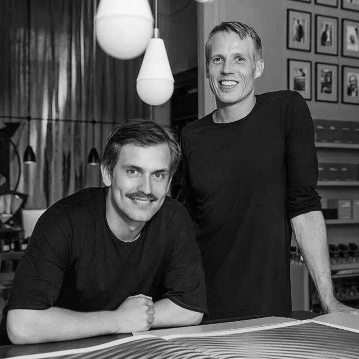
Peter Steffensen, Editor In Chief (pictured at right) and Art Director  Benjamin Wernery of Plethora Magazine.

Peter Steffensen, Editor In Chief (pictured at right) and Art Director  Benjamin Wernery of Plethora Magazine.

The aim for us was to turn all the inherent and presumed ‘flaws of print’ upside down and then amplify and refine them to a degree were they became attributes, specifically those qualities that are impossible to digitize.
— Editor-In-Chief, Peter Steffensen
Plethora_Magazine_Issue_6_SWARM_01-kopier.jpg
19.jpg

Inspired By: Installation Artist Pernille Snedker Hansen

All photos taken from www.snedkerstudio.dk.

All photos taken from www.snedkerstudio.dk.


Partly calculation, partly chance: The Evolution of Formation

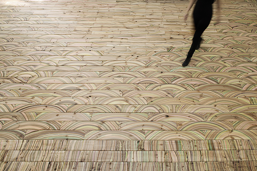
It's not every day that we stumble upon an artist or maker doing something truly innovative with wood flooring, but when we discovered the work of Copenhagen-based artist and craftswoman Pernille Snedker Hansen - we were totally floored.

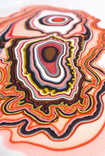
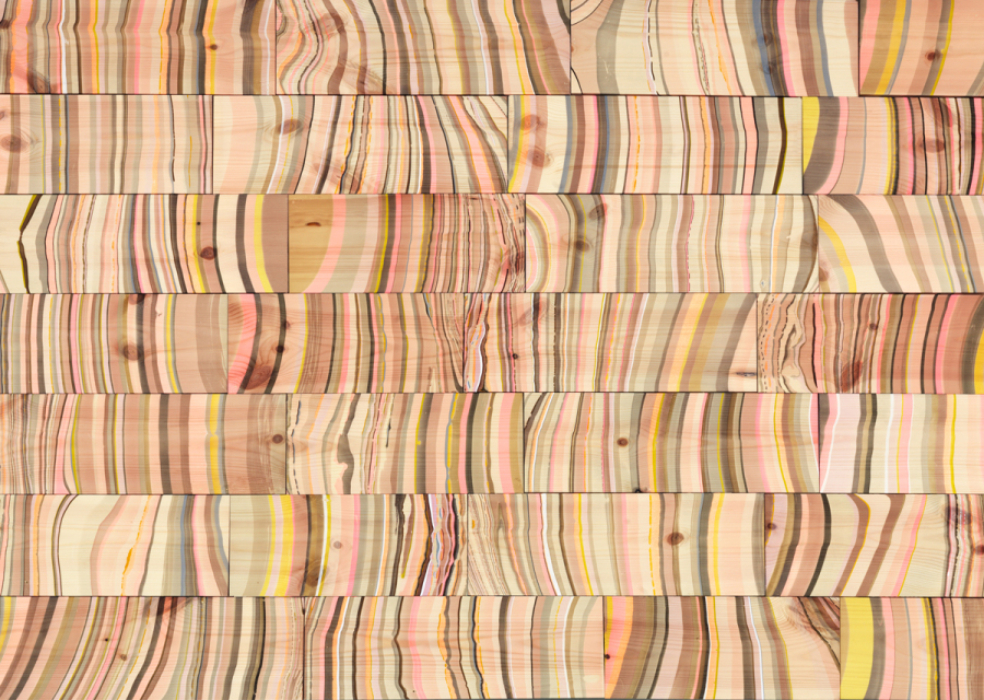
The founder of Snedker Studio, Pernille specializes in custom, handcrafted wood surfaces and commissioned artworks. Her current work is defined by the use of colorful patterns and organic forms applied to both paper and wood flooring. By combining the random with the intentional - her work is at once whimsical and structured.

One admirer has described Pernille's work as, "immersive artworks" and we have to agree - by replicating the fluid, asymmetrical aesthetics of nature and combining those forms with the careful human touch of the artisan, Ms. Snedker Hansen is creating works that are both singular and inspiring. 

Another perspective on the artist's work, from her own website:

"In search of visual phenomena in nature like structures of wood, grain, patterns of growth, Pernille Snedker Hansen sets out to experiment with techniques to imitate and magnify nature. Organic processes become scripts for the artist’s movements with her tools: water, numerous small bottles filled with various colors, wood, paper and a careful choice of colour combinations; combing through materialised occurrences like a colour drop spreading in the water basin, pushed away from its inner circle to the edge by the next drop falling into it. What happens is partly calculation, partly chance, loosing the artist’ hold on the process but at the same time being incredible aware and highly concentrated on the evolution of formation."

Our team is always on the lookout for creative makers who are pushing the boundary of what's possible in wood flooring design and Ms. Snedker Hansen certainly fits that description. We're especially smitten with her Refraction and Arch flooring installations. And while we can't wait to see what this inspiring artists comes up with next, there's plenty of Pernille's work out there to admire. Trust us, you want to dive into the full spectrum of her impressive and chromatic body of work.

You can learn more about Pernille at her official website and follow her inspiring posts on Instagram. All photos taken from www.snedkerstudio.dk.

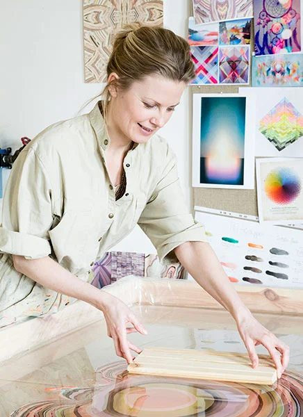
The artist at work in her Copenhagen studio.

The artist at work in her Copenhagen studio.

All photos taken from www.snedkerstudio.dk.

All photos taken from www.snedkerstudio.dk.

INSPIRED BY: FRAMA, COPENHAGEN

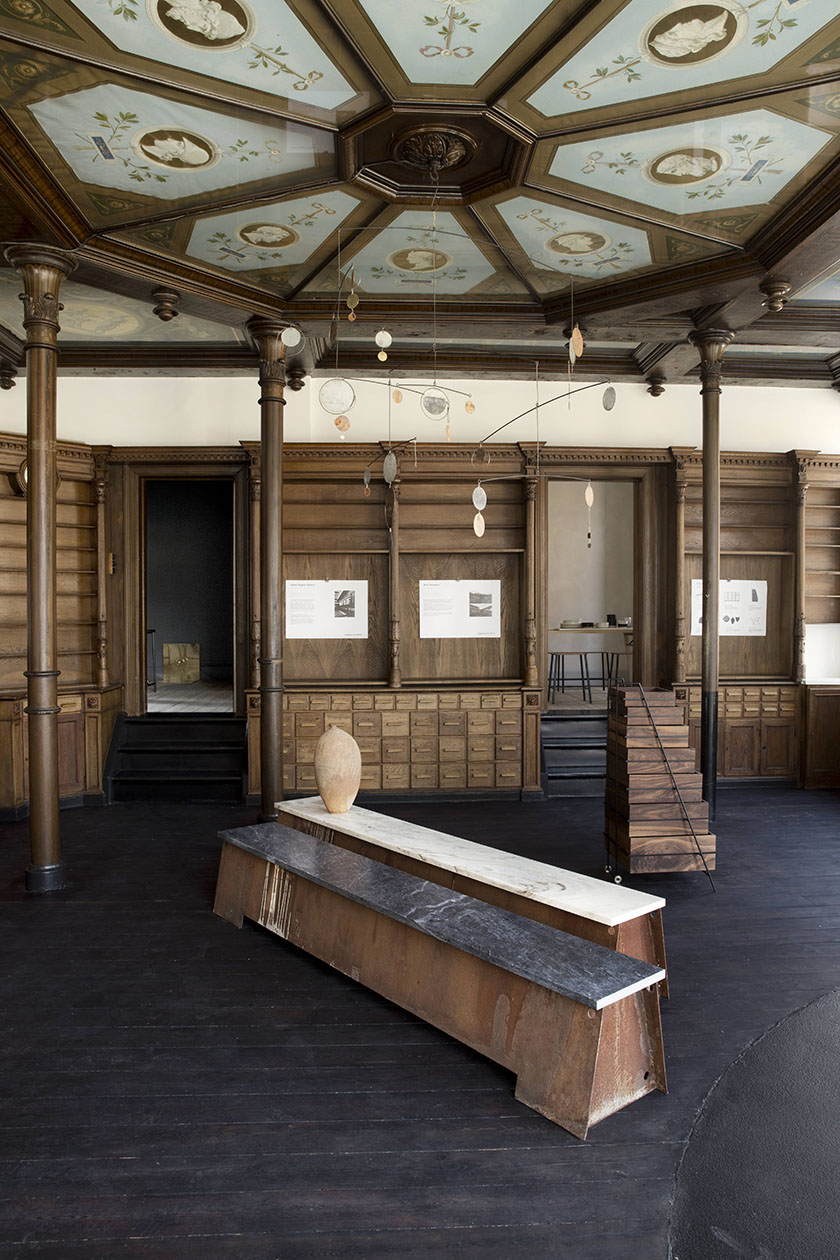
Frama Showroom, Copenhagen.

Frama Showroom, Copenhagen.

Frama's free-standing kitchen.

Frama's free-standing kitchen.

St. Paul's Apotek, home of Frama, Copenhagen

St. Paul's Apotek, home of Frama, Copenhagen

Frama CPH: crafting elegant, innovative, and classic forms

This week we are taking a good long look at the inspiring work of Copenhagen design house Frama.

Specializing in minimalist forms with a classical aesthetic, Frama is turning out some of the Scandinavian design world's most coveted stoneware, furniture, lights, and custom-built kitchens.

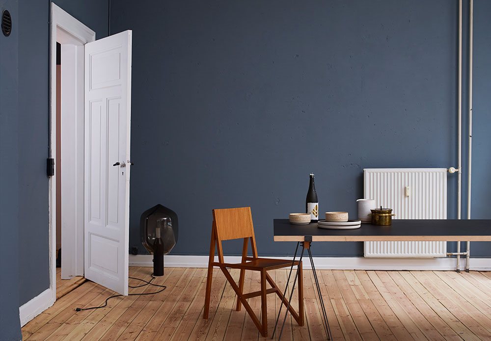
Located in Copenhagen's historic Nyboder neighborhood, the Frama showroom and offices occupy the lovingly preserved St. Paul's Apotek (a pharmacy from the 1800's that has saved much of its original woodwork and architectural elements, see above at right). Much of the Frama studio is painted in 'St. Paul's Blue,' their custom brand color, created in partnership with Jotun paint makers.

One of Frama's most exciting and ambitious innovations is their new line of custom-built kitchen designs (see above left). Unlike traditional kitchens, a Frama Kitchen is a completely free standing unit and is not permanently mounted to floor or walls. The Frama Kitchen's steel frame and steel box drawers are more like pieces of furniture within the kitchen environment than the traditionally built 'in-storage' style kitchen. 

In addition to their drool-inducing custom kitchens, the current Frama Collection contains furniture, accessories and lighting made from a variety of high-quality, high-character materials, including cork, wood, marble and metals. With their impecable eye for clean, modernist aesthetics and their appreciation of timeless materials, Frama is not only a 'brand to watch,' they are also a design house whose approach to creativity and craftsmanship are certain to inspire us at The Hudson Company for a long time to come.

See more from the Frama Collection here.

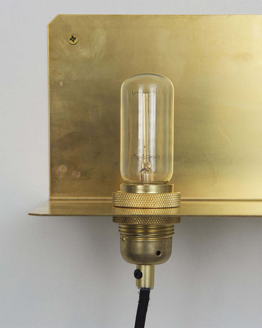
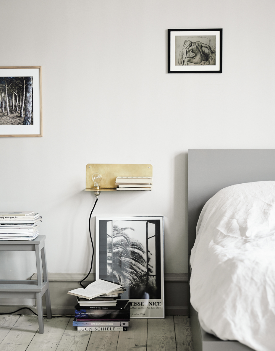
The 90 degree wall light by Frama.

The 90 degree wall light by Frama.

Aj Otto Stoneware by Frama.

Aj Otto Stoneware by Frama.

Frama Studio, Copenhagen, Denmark.

Frama Studio, Copenhagen, Denmark.

Photos courtesy of Frama and Kinfolk.

Inspired By: Oliver Gustav Studio | Copenhagen, Denmark

We are beginning a new weekly series here at The Hudson Company Blog. Every Friday we will be featuring the people, places, or products that inspire us.  We hope that this new 'Inspired By' series will also be an inspiration to you.

Today we begin by sharing images from the beautiful studio of Oliver Gustav located in Copenhagen, Denmark. 

A creative consultant whose focus is on "artisanal and holistic interiors", Oliver's Studio also functions as a shop whose contents compliment the designer's tastes acutely. Here you'll find one of a kind pieces made of wood, stone, linen and ceramic along with marble or leather boxes by Michael Verheyden and with a variety of texturally compelling pieces that suite Oliver's signature look. His collection of larger scale works such as lighting and seating by Poul Kjaerholm complete the ensemble with flawless curation.

All photos from olivergustav.com.