Blog

museum

Reflecting on THE legacy of artistic problem-solver Wharton Esherick

 
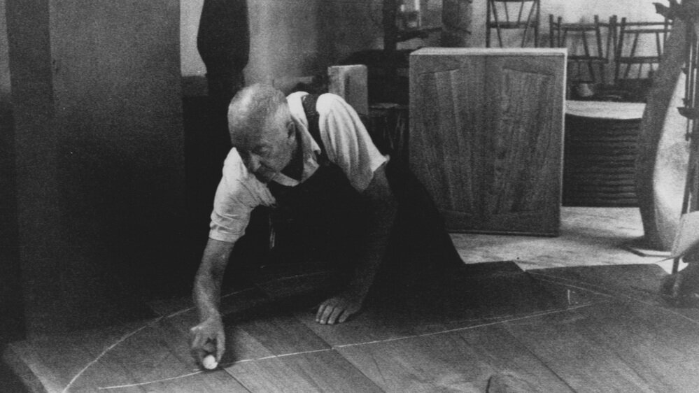
WEoldchalkinglinesfortable.jpg
 

If you’re familiar with the work of Wharton Esherick (1887–1970), you’re probably imagining the most famous spiral staircase in Pennsylvania right now. Built in 1930 to replace a traditional staircase, it’s tightly curled and elegantly carved from red oak, with a rustic form that appears to defy gravity. Its thick treads seem to float as they spiral around a curvy central column. They’re actually mortised in place and supported by tenons, but the lack of any supporting structure (apart from a mastodon tusk handrail that was added in the late 1940s) gives the staircase an air of magic. It’s just one example from a long career in which Esherick seemed to ask himself what he could do with wood, and never backed away from a surprising answer. Unorthodox solutions and clever workarounds abound in his unique home and studio in Paoli, PA, which is now the site of the Wharton Esherick Museum. And that makes sense, because he never trained as a woodworker; first and foremost he was an artist, and he was able to fashion wonders from any material, never letting the strictures of carpentry fence him in.

 
The Spiral Staircase in Wharton Esherick's home and studio, 1930.  Photo credit: ©LeslieWilliamson from Handcrafted Modern, Rizzoli, 2010.

The Spiral Staircase in Wharton Esherick's home and studio, 1930.
Photo credit: ©LeslieWilliamson from Handcrafted Modern, Rizzoli, 2010.

Wharton Esherick in his studio with his sculpture Oblivion (dated 1934.) Photo credit: c. 1934 by Emil Luks. Image courtesy of the Wharton Esherick Museum.

Wharton Esherick in his studio with his sculpture Oblivion (dated
1934.) Photo credit: c. 1934 by Emil Luks. Image courtesy of the
Wharton Esherick Museum.


Famous for saying “If it isn’t fun, it isn’t worth doing,” Esherick crafted furniture, made sculpture, designed lighting and interior fittings, and even whole buildings. He’s considered an icon of the Studio Furniture Movement of the mid-20th century, and having lived and worked in Bucks County, he’s also linked to a group of important Pennsylvania makers of his era: George Nakashima, Phillip Lloyd Powell, and Paul Evans. He came from a well-to-do Philadelphia family, and studied printmaking and drawing at the Pennsylvania Museum School of Industrial Art (now known as the University of the Arts), then painting at PAFA, the Pennsylvania Academy of Fine Arts. He was discovering the world of painting just as American Impressionism was flourishing in Philadelphia and Bucks County. Esherick and his wife Letty settled in Paoli after finishing school and bought an historic farmhouse. Here he became interested in carpentry and the sculptural possibilities afforded by wood.

Esherick initially carved woodcuts—a natural outgrowth of his printmaking practice from art school—then he began making abstract sculptures from wood from in the 1920s. In 1926 his work was exhibited at the Whitney Museum of American Art. He then embarked on the long process of designing and building his own home and studio. And by the mid-1930’s, he was creating elaborate interior elements for local clients such as his famous doorway and fireplace for the Curtis Bok House. Considered some of his most important works, the dramatic doorway was meant to evoke the look of draping fabric, while the fireplace, which echoes Art Deco design but veers toward a more extreme, angular style, was inspired by the dramatic shadows cast by a roaring fire.

 
Fireplace and door by Wharton Esherick from the Curtis Bok House, 1935. Image courtesy of the Wharton Esherick Museum.

Fireplace and door by Wharton Esherick from the Curtis Bok House,
1935. Image courtesy of the Wharton Esherick Museum.

“A Pennsylvania Hill House” designed by architect George Howe for the "America at Home" display at the 1939 World's Fair. Photo by Richard Garrison. Image courtesy of the Wharton Esherick Museum.

“A Pennsylvania Hill House” designed by architect George Howe for
the "America at Home" display at the 1939 World's Fair. Photo by Richard Garrison. Image courtesy of the Wharton Esherick Museum.


Over the next several decades, his work was hard to pin down stylistically. Some works were crisp and geometric like the Bok House architectural elements. Others, like his own staircase and the biomorphic, abstract forms he sculpted, were soft and organic. In 1940, he created a suite of furniture for the exhibition “America at Home” for the 1939-1940 New York World’s Fair. Sixteen architects were invited to design rooms for the exhibition showcasing new American designs, and architect George Howe, who designed Philadelphia’s PSFS building on Market Street, invited Esherick to take part. Howe’s room was called “A Pennsylvania Hill House,” and its design captured the mix of modern and rustic style that was emerging in places like Bucks County in the middle decades of the 20th century. Esherick’s contributions to the exhibition included a sofa from the Bok house, the famous spiral staircase, a five-sided hickory table, and cherrywood wall panels. This exhibition represented the first time that Esherick’s work was seen by a wide-ranging public. Lousie V. Sloane, who was in charge of publicity for the “America at Home” display, wrote in a letter to Esherick that “The ‘Pennsylvania Hill House’ is a very popular room with visitors… and the stairway continues to bring forth exclamations, questions and comments from those who go through the building.” 

By his later years, Wharton Esherick was known among colleagues and admirers as the “Dean of American Craftsmen.” His work would eventually earn him a retrospective at the Museum of Contemporary Crafts (now the Museum of Arts and Design) in 1958, and a Gold Medal from the New York Architectural League. His work is included in the collections of the Renwick Gallery of the Smithsonian Institution in Washington, D.C., Metropolitan Museum of Art, The Whitney Museum of American Art, the Philadelphia Museum of Art, the Museum of Fine Arts Boston. One legacy of Esherick’s earliest years working with wood—and a renewable form of accessible art—are his printed holiday cards.

When he was first settling in Paoli and exploring his new surroundings, he made prints that captured the seasons, and his snow-covered scenes of houses and hills were very popular when he made them (and they still are today.) One such print, called “January,” appeared in The Century Magazine, and other prints of his were published in Vanity Fair and The New Republic. “January” depicts a person walking up a road blanketed with snow, with a single blackbird perched on a nearby fence, and four more circling overhead. Using the end grain of a block of wood to create the image, he carved away much of the lower third of the print to leave a pillowy expanse of pristine snowfall. It has an air of mystery, with frost disguising the landscape underneath, and the figure faces away from us. Looking at this image now, it seems quite modern for 1923. And in 2020, there’s something uncannily familiar about it. This holiday season, marked in so many ways by the COVID pandemic, means that many of us have carved out small groups to celebrate with, and some of us will celebrate solo. It feels strange, and it’s not easy. Esherick’s print is not overtly “Christmas-y,” and contains no text, but its single figure with his neighborly birds sends us a timely and powerful message. The only thing to do, especially in the cold and unknown, is to walk straight ahead.

 
“January”, 1923, wood engraving by Wharton Esherick. Image courtesy of the Wharton Esherick Museum.

“January”, 1923, wood engraving by Wharton Esherick. Image courtesy
of the Wharton Esherick Museum.



INSPIRED BY: VITRA CAMPUS

Rolf Fehlbaum is the son of Willi and Erika Fehlbaum who founded Vitra, a company who began producing Eames chairs in 1957 when Rolf was only a teenager. 

Now, taking charge of the company, Rolf has crossed new boundaries bringing together such diverse inventory has that included Mies van der Rohe, Noguchi, Aalto, Corbusier and Lloyd Wright's Peacock chair. Before long Fehlbaum had gathered enough pieces to open his own museum near Tüllinger Mountain in Germany, which is now one of the largest collections of furniture on the globe.

Currently though Rolf has moved into collections of a much larger scale, specifically that of architecture, for the Vitra Campus. In a recent article from Cereal Magazine we see a look into this very diverse design playground which is summed up quite well with this quote from the author.

"Vitra’s stake in 21st century design is such that the shape it takes affects they way our homes and our workplaces look, and how the products we buy are made. In this wonderland curated by Erika and Willi’s eldest, drawing visitors in from near and far, design is a game played with deadly seriousness."

Photos from Cereal Magazine.

Crafting The Whitney Floors | Part 3

Writing for The Wall Street Journal, Kelly Crow notes that the design of art museums has traditionally fallen within two camps: classicism or stark modernity.

Historically, collectors encouraged museums to create spaces that resembled cultural temples, with classical columns and ornate crown moulding to match the significance of the objects on display. In recent decades, many museums and galleries favored an architecture of stark white-cube rooms with walls treated in sleek, modern finishes...
[Yet] when the Whitney began considering designs more than a decade ago, Adam Weinberg, the director, said he asked architects for the exact opposite.

Ms. Crow goes on to describe how the new Whitney Museum of American Art is a museum, 'designed to wow artists as much as audiences.' In her piece on the new Renzo Piano designed museum, Crow outlines Mr. Piano's intentions for the Whitney to be a new kind of museum - one that invites curators and artists alike to be flexible, innovative, even playful:

'...the 84-year-old [Whitney] museum is changing far more than its address...
The new building’s nearly 50,000 square feet of gallery floors will be made of neither trendy concrete nor lavish marble. Instead, Whitney officials chose reclaimed Heart Pine from former area factories, so artists could hammer nails into it or tear up small sections if needed. (The museum has a cache of extra planks in case anyone does.)
A lattice-like grid on the ceiling of the main gallery means artists won’t have to cut through drywall to suspend their work. That 18,200-square-foot room has no columns, making it the largest museum gallery in New York City with uninterrupted views.”

Donna De Salvo, the museum's chief curator, told ABC News that, 'artists will be inspired by the new spaces and will "reinvent them over and over again." They're tailored to the needs of how artists — and curators — work, she said. Floors throughout are sprung, allowing for both performance and installations. Open-grid ceilings permit walls and art to be arranged into multitude configurations.'

In crafting the over 50,000 square feet of Reclaimed Heart Pine flooring for the new Whitney Museum, The Hudson Company is honored to be a part of this landmark of innovative, contextual, and culturally-significant architecture.

The industrial history of the Reclaimed Heart Pine floors (sourced from decommissioned American factories) supports the Whitney’s mission to create a space that Director Weinberg calls, 'rough and ready' artist’s canvas.  The nature and dimensions of the Reclaimed Heart Pine flooring, along with it's intentionally flexible profile, allows for the floors, like so much at the new Whitney, to be modified to best fit the needs of the museum, artists, and audiences using the space. 

Click for more details about The Hudson Company Reclaimed Heart Pine [Chalk Finish] flooring featured throughout the new Whitney Museum of American Art.

Click to learn more about The Hudson Company + Whitney Museum Design Installation.

Click to watch the new Hudson Company Video.

Detail of Reclaimed Heart Pine [Chalk Finish] installed at new Whitney site.

Detail of Reclaimed Heart Pine [Chalk Finish] installed at new Whitney site.

Floor during install.

Floor during install.

Floor Install, NYC Skyline in the background.

Floor Install, NYC Skyline in the background.

Flooring Install, during finishing.

Flooring Install, during finishing.

Whitney floor, during install.

Whitney floor, during install.

All Installation Photos by Martin Hyers of Gentyl&Hyers Photography for The Hudson Company. Cover photo by Max Touhey for ny.curbed.com.

Crafting The Whitney Floors | Part 2

Writing for The New York Times on April 19, Michael Kimmelman described the new Whitney Museum of American Art this way:

'There’s a generosity to the architecture, a sense of art connecting with the city and vice versa...
Inside, irregularly weathered pine floors recycled from old factories temper a language of concrete and steel. Those same industrial materials break up the mass of the building on the outside, by turns refracting and absorbing sunlight, nudging upward, gently, the scale of a swiftly growing neighborhood.'

The story behind these 'irregularly weathered pine floors recycled from old factories' is, in fact, a rather remarkable one - the journey of rough, antique, and landfill-bound timbers carefully re-imagined and re-engineered as the flooring for New York City's newest architectural landmark.

Custom Milling The Whitney Floors

After reclaiming the raw timber materials from inactive American factories (Phillip Morris, Maidenform, Paul G. Mehlin & Sons Piano Company), The Hudson Company embarked on the fully-integrated, custom milling process, in collaboration with Cooper Robertson and The Renzo Piano Building Workshop, the museum's lead architects. 

The final Whitney installation exceeds 65,000 square feet of Reclaimed Heart Pine [Chalk Finish] flooring throughout all of the galleries and administrative offices.  In order to deliver the final product, The Hudson Company custom milled over 270,000 board feet of reclaimed timbers. These sizeable timbers ranged in size from 4” x 17” x 22’ to 11” x 17” x 24’, some weighing in excess of 1,200 pounds.

Once the raw material arrived at our Pine Plains, NY facility, metal detectors were used to locate old fasteners (nails, bolts, screws) embedded within the timbers, and then all unwanted debris is removed by hand.

Next, utilizing our 75 HP fully hydraulic 6” double edge blade saw mill, we milled the timbers into manageable dimensions (1.75" x 10" x 8-20').  Because the Whitney floor was uniquely designed to be 1.5” x 8,” we oversized the the flooring planks to 1.75” x 10" and then kiln dried each plank to 165 degrees Fahrenheit eliminating any remaining insect life and setting the pitch for stability and proper finishing.

From here, the Whitney floors went through the remaining steps of The Hudson Company's hands-on, custom milling process: the planks were re-graded, planed, ripped, molded, and checked for defects and unwanted irregularities before delivery.

Click for more information about The Hudson Company, our team, and for galleries of our reclaimed and custom-milled flooring installation projects.

Click to watch The Hudson Company sourcing and milling video.

Inside The Hudson Company's Pine Plains, NY Mill.

Inside The Hudson Company's Pine Plains, NY Mill.

Milling reclaimed material, Pine Plains, NY.

Milling reclaimed material, Pine Plains, NY.

De-nailing the reclaimed industrial timbers at the Pine Plains, NY Mill.

De-nailing the reclaimed industrial timbers at the Pine Plains, NY Mill.

Milling reclaimed material, Pine Plains, NY.

Milling reclaimed material, Pine Plains, NY.

Reclaimed Heart Pine [Chalk Finish] planks on site at the new Whitney Museum, ready for Install.

Reclaimed Heart Pine [Chalk Finish] planks on site at the new Whitney Museum, ready for Install.