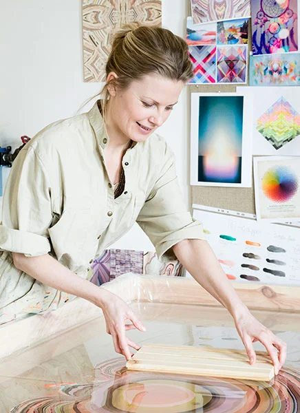

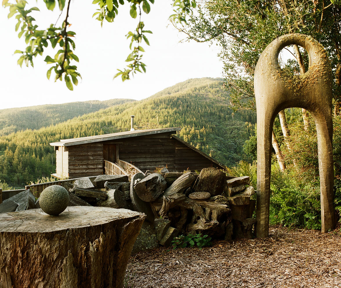
Underneath a bank of skylights in her Crosby Street loft, with all her tools arrayed on a butcher block work table, artist Jill Platner makes her signature feather-like metal jewelry by hand. She’s developed a method for joining pieces of metal so that it drapes like fabric, and she has an acute feel for the material and knowledge of the tools of her trade. And she does all this inside a Federal style house in NoHo that practically radiates American history. Originally built in 1823 as a townhouse for James Roosevelt, an ancestor of FDR, in the 1850s the building housed a hospital run by Dr. Elizabeth Blackwell, the first American woman to earn a medical degree. With her sister Emily, also a physician (the sisters were the first and third women in America to earn medical degrees, respectively) Blackwell rented the building in 1857 and made it the home of the New York Infirmary for Indigent Women and Children. With the help of wealthy benefactors, many of them Quaker, the Blackwells ran the first hospital in America that was staffed entirely by women.
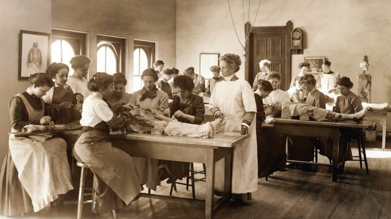
The hospital ran by Dr. Elizabeth Blackwell that occupied the Crosby Street building in the 1850s.
Platner is fascinated by the building’s past, and her painstaking work renovating the building has revealed tantalizing pieces of its history. When she first toured it as a young designer in need of studio space in the 1990s, she noticed details like the chisel marks on the wooden beams—clearly the handiwork of a skilled craftsman—and recognized something of a kindred spirit. Platner made the light-filled top floor her studio, then expanded into the adjacent carriage house which is where she fabricates jewelry and makes large-scale metal sculptures.
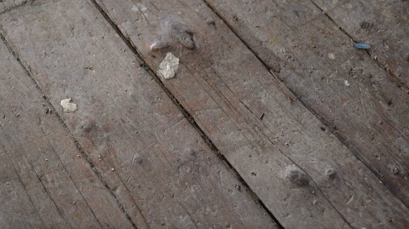
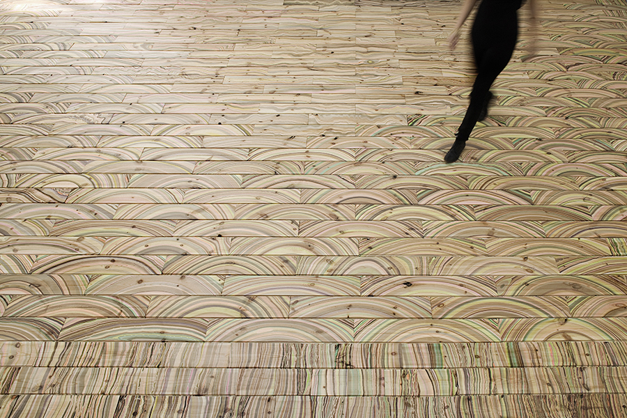
The original flooring before being salvaged and milled by The Hudson Company.
In 2007 when she was preparing to buy her space, Platner discovered the story of the Blackwell sisters. Her top-floor studio was once the dormitory for the physicians and interns, while the lower floors were devoted to the maternity and illness wards, the pharmacy, and the waiting area. By 2012, when Platner became a part owner of the building, it was badly in need of repairs. There were bulging bricks and the roof was in dire straits. But she was committed to keeping intact as much of the building’s original material as she could, and that’s where The Hudson Company came in. Underneath some particle board, she discovered ten-inch wide boards that were original to the house. Well worn and quite uneven, Platner arranged to send the salvaged boards up to Pine Plains where they were milled and finished, then reinstalled. Now even and uniform, but still full of history and character, the floors are back where they belong on Crosby Street. “It looks incredible,” Platner says. “You can feel history in it.”

Jill Platner’s Studio. Photo credit: Aundre Larrow for The New York Times.


![Custom mood board by designer Amanda Jane Jones for The Hudson Company, featuring Select Harvest Ash [Neva Finish] flooring.](https://images.squarespace-cdn.com/content/v1/544e3a5ce4b0117bc5e24e56/1469459511300-JCOA35701YL5GUHQVETT/image-asset.jpeg)