Our New Manhattan Showroom | Opening February 1, 2017

A work in progress: The Hudson Company's new Manhattan Showroom, opening Feb 1.

A work in progress: The Hudson Company's new Manhattan Showroom, opening Feb 1.

The Hudson Company Comes to Manhattan!

We are thrilled to formally announce the opening of The Hudson Company's new Manhattan Showroom on February 1, 2017. In just a matter of weeks, this new showroom space (designed by our friend Brad Ford), will be open to clients, partners, designers, architects, and the general public alike.

We look forward to welcoming you to our new space at 5 East 20th Street very soon. More showroom news and images to follow in the coming days.

Stay tuned to Instagram, Facebook, and this blog for the latest news.

Work in progress at the new Hudson Company Manhattan Showroom.

Work in progress at the new Hudson Company Manhattan Showroom.

IMG_3357.jpg
IMG_3347 (1).jpg

The Hudson Company Featured at AndNorth.com

Photos by Kyle Dorosz for www.andnorth.com. Read And North's full profile on The Hudson Company here. 

Photos by Kyle Dorosz for www.andnorth.com. Read And North's full profile on The Hudson Company here. 

We are thrilled to be featured on the outstanding And North website this month! Thanks to author Nikki Ridgway for the thoughtful profile and to Kyle Dorosz for the stunning photos. Below is an excerpt from the story, but go ahead and visit andnorth.com to read the full story.

Before The Hudson Company was a supplier of reclaimed wood flooring for the east coast’s top designers and architects, it was Antique and Vintage Woods of America, a company founded in 1995 by a retired math teacher in Kent, Connecticut. By 2009, the company was crafting wood floorboards and paneling from old barns, mills, and bowling alleys for local homes and businesses, but hadn’t quite tapped into New York’s design and architecture communities where there seemed to be a growing trend in using reclaimed wood for commercial and interior design projects...
[Today] The company has grown from eight employees to a team of 25 specialists in carpentry, woodwork, and design, all of whom are involved in the reclamation process, including sourcing the wood from old barn siding, disused Manhattan water towers, and 19th-century industrial structures across New York State and beyond. “From barn to factory, we handle the denailing, re-sawing, grading, kiln drying, molding, and more right here,” says Jamie Hammel, “we’re a manufacturing company in the state of New York, and that’s not easy, but we’re trying to create a company where people want to spend their whole careers.”

Read And North's full profile on The Hudson Company here. 

The Hudson Company + rag & bone Tribeca

rag & bone's new men's store at 228 West Broadway in Tribeca. Photo via tribecacitizen.com.

rag & bone's new men's store at 228 West Broadway in Tribeca. Photo via tribecacitizen.com.

A Custom Floor for a custom men's shop

This year, The Hudson Company had the privilege to partner once again with the good folks at rag & bone New York to help them curate the interior design of their tenth New York City retail location.

From its origins in New York in 2002, rag & bone instantaneously distinguished itself by combining British heritage with directional, modern design. Today, the brand has become synonymous with innately wearable clothing that melds classic tailoring with an edgy yet understated New York aesthetic.

For their new 'men's only' store in Tribeca, rag & bone's design team had a specific vision for how to create a luxury shopping experience catered specifically to men - a vision that included custom graffiti in the dressing rooms, an authentic Stormtrooper costume, and a one of a kind Hudson Company parquet floor.

Original flooring design concept by The Hudson Company.

Original flooring design concept by The Hudson Company.

A Truly Collaborative Design solution

From the outset of the project, the designers knew that they wanted to create a custom parquet floor with a 'graphic' feel to it. From here, The Hudson Company team suggested a direction for a White Oak flooring design (see sketch at left). 

The boutique's finished floor was constructed of a combination of straight flooring planks and 24" x 24" parquet panels. The color and finish of the floor was custom selected by the design team to complement the overall interior design of the boutique. 

As with all of our creative partnerships, it is a pleasure to help innovative brands and their design teams reach their project goals.

See our White Oak Herringbone floor for the rag & bone at Bloomingdales location.

Visit the rag & bone men's shop and see this unique floor in person: rag & bone Men's Shop is at 228 West Broadway, New York, New York 10013. Phone: 646 277 836. Store Hours: Monday - Saturday: 11am - 8pm, Sunday: 12pm - 6pm.


Detail of the store's custom White Oak parquet flooring design.

Detail of the store's custom White Oak parquet flooring design.

Detail of rag & bone Tribeca flooring installation.

Detail of rag & bone Tribeca flooring installation.

The Hudson Company + Frama CPH

Custom mood board by Frama CPH for The Hudson Company.

Custom mood board by Frama CPH for The Hudson Company.

The Hudson Company + Frama

Scan almost any list of top design studios coming out of Scandinavia, and you will come across the name Frama - a Copenhagen-based design shop and creative team at the very forefront of Scandinavian chic. With their one-of-a-kind office space in Copenhagen's historic Nyboder neighborhood, Frama is a trendsetting brand that refuses to be boxed in by industry adjectives, which is appropriate, as the brand is constantly reinterpreting, rediscovering, and reimagining what it means to be a 21st century design leader (we think the photos below speak volumes about the quality and timeless elegance of Frama's work).

Here at The Hudson Company, we have been fans of Frama's inspired work for a long time, so, of course, we were thrilled this past summer, when they graciously agreed to create a custom mood board for us. Choosing from our full product range, Frama chose to focus in on our Select Harvest White Oak [Barley Finish] to use as the backdrop for their custom mood board.

Read on for some insights into what keeps the creativity flowing at Frama and how they brought this inviable mood board to life for The Hudson Company.

5 Questions with Frama

Tell us about the items included in your mood board, what's their origin story? Why did you select them for this mood board?

The objects of focus in our mood board design is our line of Aj Otto Stoneware - designed by Frama Studio here in Copenhagen. The ceramics are hand made in Denmark, which provides each product in the collection a unique feel. Although it has a Scandinavian aesthetic, the idea for this collection came from some old Italian glass food-containers discovered during some southern travels a few years ago.

Along with the Aj Otto stoneware, we've also included a variety of vintage and new brass pieces in our mood board. The cutlery is from different flee-markets, while the candleholders are designed by a young danish designer Maribel Carlander for Frama. Cut out of solid, untreated brass, these candle holders are a careful study in geometry, proportion and composition. Lastly, the E27 Table Light (also designed by Frama), is a simple, industrial and straight forward lamp which provides a cozy light to any table setting.        

Where does that team at Frama turn for inspiration, what sources are consistently inspiring?

Most often our best inspiration comes from dialogues with interesting people we meet on our travels, with whom we collaborate, or from people who stop by our studio.  

Overall, it's a central focus of ours to find the right balance between the traditional and the contemporary aesthetics, so we often look back in time for our inspiration whether that's to old art-posters or to historical building detail. Many of Frama’s design ideas grow out of the interior design projects we work on. We find that great inspiration can come from nature, art. architecture, as well from basic shapes and forms. 

Color and texture seems to be especially important to the items and collections that Frama produces: can you talk about that a little bit? 

Yeah, sure. Everything we do stems from an idea that we call "slow production." We use solid woods, untreated metals and stone to create both a aesthetically pleasing product, but also something that will “live” for a long time - these are long lasting and “honest” materials. Our design language is pretty straight forward, based in simple geometry and subtle, natural colors. These are the elements at the center of the Frama design universe. But we also love rich colors.

Choosing the right colors is essential for curating the final expression any space will have. So, with that in mind, we really thoughtful with how we use color - both in painted and non-painted finishes - so that everything is complementary. That's how we developed our St. Paul's Blue paint color with Jotun and it's how we got started with our upcoming line of colors based on the interiors of an historic Copenhagen space (coming in 2017).    

Is there a driving design vision or 'manifesto' that you use in your work and collaborations?

We often work within the area of re-interpreting design archetypes. Therefore, the objects of our collection often signals a return to basics. Our vision is always to come up with something new, but we try to maintain a historical feel to everything we do. The synergy between the past and present is important for our design process. Our main interests lay somewhere between two opposite poles - that space between classical and the contemporary design, that incorporates both digital and analogue production. 

Why did your team chose Select Harvest White Oak [Barley Finish] flooring as the background for your mood board? 

We chose this specific White Oak flooring because of its honesty. It has rich veins and you can clearly see and feel the knots in the wood. The color of the flooring is warm (natural white with a slightly golden hue) which provides a cozy feel to the mood board. Also, since it's Oak, you know that it is a solid, enduring surface. These are all qualities of material that reflect the Frama vision.

You can learn more about Hudson Company White Oak Center Cut, Barley Finish] here, and more about Frama here. 

Follow The Hudson Company on Instagram. Follow Frama on Instagram.

All photos courtesy of Frama CPH.

Frama Studio in Copenhagen, Denmark. All photos courtesy of Frama CPH.

Frama Studio in Copenhagen, Denmark. All photos courtesy of Frama CPH.

We often work within the area of re-interpreting design archetypes. Therefore, the objects of our collection often signals a return to basics. Our vision is always to come up with something new, but we try to maintain a historical feel to everything we do. The synergy between the past and present is important for our design process.
Frama's home offices and showroom at St. Paul's Apotek in Copenhagen.

Frama's home offices and showroom at St. Paul's Apotek in Copenhagen.

Hudson Company Select Harvest White Oak [Barley Finish].

Hudson Company Select Harvest White Oak [Barley Finish].

We chose this specific White Oak flooring because of its honesty. It has rich veins and you can clearly see and feel the knots in the wood. The color of the flooring is warm, and since it’s Oak, you know that it is a solid, enduring surface. These are all qualities of material that reflect the Frama vision.
Custom mood board by Frama Copenhagen. Wood background is Hudson Company Select Harvest White Oak [Barley Finish].

Custom mood board by Frama Copenhagen. Wood background is Hudson Company Select Harvest White Oak [Barley Finish].

Setting The Stage: The Hudson Company + Field & Supply 2016

In designing the stage, I was inspired by artist Donald Judd. I wanted to create a simple form that complimented the materials (White Oak) but didn’t distract from the natural surroundings.
— Designer Brad Ford
Donald Judd, Untitled sketch, 1967, Graphite on paper. (C) Judd Foundation.

Donald Judd, Untitled sketch, 1967, Graphite on paper. (C) Judd Foundation.

Donald Judd, Untitled Works in Concrete: Chinati Foundation, Marfa, Texas, 1984.

Donald Judd, Untitled Works in Concrete: Chinati Foundation, Marfa, Texas, 1984.

Finished Field + Supply stage, designed by Brad Ford and built with Hudson Company White Oak planking.

Finished Field + Supply stage, designed by Brad Ford and built with Hudson Company White Oak planking.

Setting The Stage at Field + Supply 2016

This October, The Hudson Company was proud to be a partner of Field + Supply, an event led by New York based designer Brad Ford. Over the past three years, this multi-day experience has grown to include bespoke furniture, ceramics, and textiles. And for this year's Field + Supply event, The Hudson Company partnered with Brad Ford to create a temporary stage for the weekend's lineup of musical performances.

Inspiration and Construction

According to Ford, the inspiration for the event's all wood stage actually came from sculptor Donald Judd, well known for his work in concrete, "In designing the stage, I was inspired by artist Donald Judd. I wanted to create a simple form that complimented the materials (White Oak) but didn't distract from the natural surroundings." Andrew Phillips of The Hudson Company points out that, "from a builder's perspective, Brad's design is extremely clean, uncluttered in detail, and understated. Simplicity in design is easy to conceptualize but always more difficult to execute."

When it came time to bring Ford’s design to life, the stage's structure was first built on site at The Hudson Company in Pine Plains, NY so that materials could be custom cut and fit to the stage's exact dimensions. Because the stage was going to be a relatively large, temporary structure, it had to be easy to build, assemble and dismantle in a short time. The stage's design called for The Hudson Company’s Center Cut White Oak to 'wrap' the stage surfaces completely, thus creating the solid mass that inspired Ford. Once the stage had been mocked up in Pine Plains and the cladding cut to fit, it was then disassembled, transported, and reassembled at the Field + Supply event site, Hasbrouk House in Stoneridge, NY.

A Quiet But IMpactful Statement

Looking back on the 2016 Field + Supply event, Ford is overwhelmed with the overall experience, "This year's Field + Supply was by far my favorite. The lush, open setting was idyllic, the crisp fall weather was perfect, and I think we had the best group of vendors to date. But one of this year's highlights was definitely the live music with The Hudson Company's stage serving as the backdrop. I think the stage made a quiet but impactful statement, which is a philosophy I share and admire in The Hudson Company."

From the beginning, this one-of-a-kind stage was meant to be temporary, built solely for this year's Field + Supply event. But, in fact, it looks like our little stage will live on and be used for future events at the Hasbrouck House.

Learn more about Hudson Company Center Cut White Oak wood surfaces.

Learn more about designer Brad Ford and Field & Supply.

The stage structure being mocked up at The Hudson Company Mill in Pine Plains, NY.

The stage structure being mocked up at The Hudson Company Mill in Pine Plains, NY.

Onsite stage build at Hasbrouk House, Stone Ridge, NY.

Onsite stage build at Hasbrouk House, Stone Ridge, NY.

From a builder’s point of view, Brad [Ford]’s design is extremely clean, uncluttered in detail, and understated. Simplicity in design is easy to conceptualize but always more difficult to pull-off.
— Andrew Phillips, The Hudson Company
Hudson Company Center Cut White Oak planking in detail.

Hudson Company Center Cut White Oak planking in detail.

The finished stage in action during Field + Supply 2016.

The finished stage in action during Field + Supply 2016.

Join us for FIELD + SUPPLY This Weekend

The Hudson Company + Field & Supply

The Hudson Company is proud to be a partner of the Field + Supply Modern Makers Craft Fair.

Field + Supply began in 2014, as a modern interpretation of a traditional arts and crafts fair.  It consists of a carefully curated selection of makers highlighting goods, old and new, from a variety of studios and workshops representing a wide range of crafts. 

This multi-day experience has grown to include delicious food and drinks from the area, along with hands-on activities as well as live music.  

This year, we've moved just around the bend to the newly refurbished Hashbrouck House in Stone Ridge, NY where we'll be able to accommodate even more makers and additional workshops. In addition, there are opportunities to enjoy cocktail parties, private dinners, a biscuit breakfast from the Hotel's new restaurant Butterfield's and a rousing celebration Saturday night to meet the makers! 

We hope you can join us over Columbus Day weekend, October 7th, 8th, and 9th at Hasbrouck House for a truly incredible gathering. Look forward to seeing you there!

*Note: All F+S guests should park at The Stone Ridge Orchard,  right around the corner from Hasbrouck House at 3012 NY-213, Stone Ridge, NY 12484. Shuttle service will be available to and from Hasbrouck House from the Orchard. There will be NO PARKING available at Hasbrouck House.

See a full list of Field + Supply exhibitors here and buy your single day or weekend tickets here.

The Hudson Company + Ashley Seil Smith

New York based artist Ashley Seil Smith

New York based artist Ashley Seil Smith

I like the warmth and texture inherent in the Reclaimed Heart Pine flooring, there’s a lot of character and line variation within the grain, which I think complements the line work in my drawings.
— Ashley Seil Smith
The artist at work.

The artist at work.

The Hudson Company + Ashley Seil Smith

Ashley Seil Smith is an artist based in Manhattan, New York with a studio in the lower Hudson Valley.  She has a background in cultural anthropology but earned an MFA in Illustration as Visual Essay from the School of Visual Arts.  In 2012 she cofounded The Period Store and eventually sold it in 2015 to focus on editorial illustration, fine art, and teaching. Ashley's commercial clients include Google, Case Agency, Forbes, Oyster Books, Isthmus, and various academic journals and nonprofits. The artist lives, and often works, in Manhattan, but escapes to the Hudson River and her studio near Bear Mountain whenever she can. In addition to freelance, commissioned, and fine art work, Ashley teaches art to a variety of ages around Manhattan with Scribble Art Workshop.

The Hudson Company first discovered Ashley's work via her inspiring Instagram feed which is, like her work, full of whimsical observations of both the natural and built environments. It would be easy to peruse Ashley's work - particularly her pen and ink drawings and ethnographic prints - and see it as simplistic. But we think that it is precisely this deceptive simplicity that is so intriguing about Ashley's work. In our opinion, there is a timeless, reflective beauty in her (often small scale) drawings as well as an exotic mystique to her prints and graphic design work.

This summer we reached out to Ashley and asked her to allow us into her creative process. Along with the insights below, Ashley was also kind enough to create a custom mood board for us, using Reclaimed Heart Pine [Original Face] as her backdrop. 

5 Questions with Artist Ashley Seil Smith

Tell us about the tools that you've included in your mood board, what's their origin story? 

I enjoy collecting older tools that can actually be used in my art practice.  Some of them were picked up at antique stores across the United States (particularly along the Hudson River Valley, where my studio is), others I inherited from my grandma, who dabbled in art and was a wildly creative person.  A lot of older tools were designed beautifully, simply, and with quality material, so using them is an esthetic and practical as well.  My rulers are my favorite tools - natural material with interesting designs and stories to tell.

How do you use mood boards in your work? What role do they play in your creative process?

Mood boards keep things concise - I believe "good" mood boards have some parameters - a limit on how much you can add, so it forces you to think through what really inspires you and why.  So much of creativity is about making decisions, and a mood board helps you identify specific things you like or aim for in your own work.

I always keep a small collection of images on a folder in my desktop, and these act as a general mood board for my work, which spans across many mediums.  They are images that I truly love and that inspire me in some way, whether it's the color palette, technique, concept, or the way the image makes me feel.  I go through my little desktop mood board about once a month and always end up editing something out and adding other things that I like better.

There are so many places to go for inspiration these days, where do you go to get inspired?

I like going to places that set my aesthetic standard pretty high, and since I live in Manhattan, I have the opportunity to visit museums fairly often - the Met, MoMA, or Museum of Natural History are some favorites.  If an art exhibit inspires me I always buy the exhibit catalogue, so I have a nice collection of art books started and I refer to them when I'm in a rut.

Other than museums, I also turn to creative sources I trust, like The Great Discontent, and I see a lot of wonderful work on Instagram and Pinterest.  Pinterest, in particular, is great when I'm doing initial research for a project.  And, like many artists, I find a great deal of inspiration in nature. If I'm not working, I'm likely walking outside with my dogs or out for a trail run or hike around Inwood Hill Park.

What can you tell us about the drawing you included in your mood board: was that an original for this mood board or something you created separately? 

This particular ink drawing was done at the beginning of the year and was inspired by Yosemite National Park. I find myself drawing a lot of scenes from places I love or that inspire me. As you can tell, I enjoy the simplicity of pen and ink as well, it's a simple medium that's good for travel, so a lot of my ink drawings are done on location.

Why did you chose this particular Hudson Company flooring as the background for mood board?

I like the warmth and texture inherent in the Reclaimed Heart Pine flooring, there's a lot of character and line variation within the grain, which I think complements the line work in my drawings. I'm a big fan of Hudson Company flooring - you manage to cover all parts of the spectrum, from rustic to modern to classic and beyond.  Natural textures paired with modern design inspire me, which is one of the reasons I started following Hudson Company on various social medium platforms. 

You can learn more about Ashley's work on her website and you can follow her creative journey on Instagram. All above photos are taken from Ashley's website or Instagram feed. All mood board photos by Gentl and Hyers

Learn more about Reclaimed Heart Pine [Original Face] here. 

Mood board by Ashley Seil Smith for The Hudson Company

Mood board by Ashley Seil Smith for The Hudson Company

The Hudson Company + Amee Allsop

Custom mood board by architect Amee Allsop, created for The Hudson Company. Photo set by Gentl and Hyers.

Custom mood board by architect Amee Allsop, created for The Hudson Company. Photo set by Gentl and Hyers.

Growing up in Australia gave me a love for the sea and the indoor/outdoor lifestyle; since it is such a young country it is not bound by many archetypes. It was there that I learned to find beauty primarily in functional forms, rather than in decoration.
— AMEE ALLSOP

The Hudson Company + architect Amee Allsop

This year, The Hudson Company has been closely following the inspiring work of New York based, Australian-bred architect Amee Allsop.

As you can see from the photos above, Amee has a distinct approach to architecture which she describes as 'an amalgamation of the city and the sea' - a theme she has developed as her career has taken her from the South Pacific coastline to New York City. With design experience in these two juxtaposed contexts, Amee is continually inspired by the contrast of wide open landscape and dense verticality.

With each architectural endeavor, Amee's design process considers space, proportion, light and materiality whilst working closely with the client and building site. For Amee, quality materials and craftsmanship are both of central importance so that her designed spaces do not feel 'disposable' but, rather, timeless and inspiring. In the spirit of Australian living, Amee's work elevate the simple and beautiful essentials of living - such as a bathtub in an open bedroom - and embodies a minimal lifestyle, rich in tactual details.

This summer we asked Amee to create a custom mood board for us and then share some insights into her creative process as well. Here are our 5 Questions with Amee Allsop...

5 QUESTIONS WITH ARCHITECT AMEE ALLSOP

Tell us about the items included in your mood board, what's their origin story? And, is there one item that's a favorite?

The origin of these materials is, for the most part, a mystery to me. And I think that is really what makes them so beautiful to me. Mostly, they are found objects: a lump of concrete right off the street, a sample of metal work from a SOHO workshop, some shelled walnuts from the corner store, a few elegant bits from the art supply shop, and then there's this gorgeous handmade copper spoon (which I've always been so curious about). 

But my favorite object has to be the photo of my son’s squishy bum. The photo was taken when he was newborn and it sits on my desk and reminds me that everything I do is not for me, it’s for the future.

How do you use mood boards in your professional work? 

Honestly, I don’t always use mood boards when I'm designing because materiality tends to evolve over the course of a project. But there is always a need for a starting point, and so, in putting together a mood board for The Hudson Company, it all started with the wood flooring sample. 

In my work, I tend to use contrasting materials in a way that makes them feel like they belong together: raw steel with smooth marble, copper and linen, walnut and oak. I feel like it's a way to use tension to create harmony. For this mood board concept, I was drawn to the character of this Select Harvest White Oak [Capella Finish] and how it was perfectly imperfect.

There are so many places to go for inspiration these days: books, blogs, Tumblr, Pinterest, etc. What sources do you typically or consistently turn to? 

That's true, these days, there are almost too many places to go for inspiration. So, the challenge becomes about reduction. When it comes to things that inspire me on a regular basis, I’m often surprised and challenged by tailored clothes and personal style, by the arts and also by traveling.

I recently travelled to Scandinavia and was inspired by the street lamps, signage, and grate drains in the streets there - they stood out to me because they were so different to what we have here in NYC. It those little things that you don’t see photos of on the internet everyday that tend to catch my eye and challenge me to think in a new way.

When it comes to design, how do you feel your Australian background has influenced you? 

Growing up in Australia gave me a love for the sea and the indoor/outdoor lifestyle; since it is such a young country it is not bound by many archetypes. It was there that I learned to find beauty primarily in functional forms, rather than in decoration. And yet, this is really contrasted with the New York City aesthetic and its history of industrial ornamentation, which is also so inspiring. I suppose I’m still on an ever-evolving journey of finding the harmony between 'The City and The Sea.'

Why did you chose this particular Hudson Company flooring as the background for mood board?

When I visited The Hudson Company Showroom in Brooklyn, this particular flooring was just begging to be touched. When I first noticed it, I didn't know anything about the Select Harvest White Oak [Capella Finish] but it looked to me like it was from some really old tree that had had a good, long life and now was given a new life as a carefully crafted and functional object.

You can learn more about Amee work on her website and you can follow her creative journey on InstagramAll Amee Allsop Studio photos provided by Amee herself. All mood board photos by Gentl and Hyers

Learn more about Select Harvest White Oak [Capella Finish] here. 

The Hudson Company + Amanda Jane Jones

Define Magazine, founded by designer Amanda Jane Jones

Define Magazine, founded by designer Amanda Jane Jones

Define came out of what felt like a need. There were so many artists that I collaborate with who talked about wanting more opportunities to create work just for the sake of creating.
— Amanda Jane Jones
The designer at home.

The designer at home.

A peak inside Define Magazine.

A peak inside Define Magazine.

The Hudson Company + Amanda Jane Jones

Amanda Jane Jones is a award-winning, freelance graphic designer and art director based in Chicago, IL but currently living with her family in Geneva, Switzerland. During her career, Amanda has collaborated with a variety of creative brands, including VSCO, Solly Baby, Kinfolk Magazine (as co-founder), and Artifact Uprising. Amanda's current passion project is the elegant new creative quarterly, Define Magazine.

When we asked Amanda to create a custom mood board for our ongoing series of creative collaborations, we knew it would be be a gorgeous, minimalist's meditation on color and simplicity. In this, we certainly weren't disappointed. But it's the story behind the items that Amanda chose to feature in her mood board that are especially fascinating: photos of her children, Pantone color swatches, and skipping stones from the shores of Lake Michigan.

Here is the story behind Amanda's lovely mood board for The Hudson Company...

5 Questions with Amanda Jane Jones

Tell us about the items included in your mood board, what's their origin story? Why did you select them for this mood board?

I'm always looking for calming influences in my life and strive for my home to be minimal, quiet, simple and calming. And since we live just a quick walk away from Lake Michigan (where I vacationed as a child with my family) I often take my children there throughout the year. The colors of the lake have always inspired me. Every time I visit the lake, I come home with at least one rock that we keep in jars on our bookshelves. The homes along Lake Michigan - especially in the Glen Arbor area - have always inspired me as well, with their white-washed wood exteriors. The Lake brings back peaceful, happy, calm memories. If the kids (or I) are ever grumpy or in a slump of some sort, the Lake is the first place we visit - the wind coming off of Lake Michigan seems to cure all. 

How do you use mood boards in your professional work? What role do they play in your creative process?

I utilize a lot of mood boards in my work. It's a huge part of my design process. I start with brainstorming, looking through my collection of books to get ideas. I also have an inspiration wall at home that I love to cover with ephemera I've collected from my travels or received from friends.

Tell us about your inspiration for Define Magazine: where did the concept come from and what inspired you to create this publication?

Define came out of what felt like a need. There were so many artists that I collaborate with who talked about wanting more opportunities to create work just for the sake of creating. It's hard to make time for personal work amid the day to day of creating for clients - so it was born out of an idea to create a space for artists to feel free to create for the sake of creating.

From my own experience, I know that artists hunger to work on projects uninhibited by the client filter and we jump at a chance to collaborate with other artists on a global scale—to make something beautiful and thought-provoking. The basis of Define is simple: each issue focuses on a single word defined by a unique set of artists through various mediums. 

So far it's been exciting to see artists explore the same theme through different perspectives. We hope it's a magazine that resonates with both artists and art lovers, so that we are able to accumulate a collection of definitions that create a beautiful anthology to be enjoyed and re-defined for years to come

Are there specific places that you turn when you need fresh ideas or inspiration? Particular books, other creative people, blogs, etc.?

When I'm in a design slump, I always go for a walk. Fresh air is always a quick fix. Also, books - both old and new. I don't think you can ever have too many books. Oh, and I love Maira Kalman - she's an endless inspiration to me.

Why did you chose this particular Hudson Company flooring as the background for mood board?

With Select Harvest Ash [Neva Finish], I love how white it is - the color is just perfect. Again, there's something calming about this kind of floor and so I'm naturally drawn to the tone and fell of Neva. At home, we recently painted our kitchen floor white and I love how it's brightened our space.

You can learn more about Amanda Jane's work on her website and you will certainly want to follow her on Instagram as well. Here you can learn more about Define Magazine. All mood board photos by Gentl and Hyers

Learn more about Select Harvest [Neva Finish] here

Custom mood board by designer Amanda Jane Jones for The Hudson Company, featuring Select Harvest Ash [Neva Finish] flooring.

Custom mood board by designer Amanda Jane Jones for The Hudson Company, featuring Select Harvest Ash [Neva Finish] flooring.

The Hudson Company + Tereasa Surratt

Stylist and creative director Tereasa Surratt

Stylist and creative director Tereasa Surratt

Like the objects I selected to lay over the planks, this flooring had humble beginnings. But over time, it’s developed this kind of mysterious, timeless patina. This wood is a remnant from another time, and, yet, in it’s own way, it’s more intriguing than ever.
— Tereasa Surratt
Tereasa Surratt and David Hernandez at Camp Wandawega.

Tereasa Surratt and David Hernandez at Camp Wandawega.

Historic Camp Wandawega, in Walworth County, Wisconsin.

Historic Camp Wandawega, in Walworth County, Wisconsin.

A peak inside Camp Wandawega's reclaimed wood treehouse.

A peak inside Camp Wandawega's reclaimed wood treehouse.

An Indecisive Hybrid

Tereasa Surratt is a woman who wears many hats. Self-described as, 'an indecisive hybrid: part creative director, part designer, part stylist, part author, part brand builder.' Surratt admits to living with a daily struggle, 'an obsession to make everything around her more interesting, beautiful, and desirable.' This energetic obsession has proved a fruitful tool for Tereasa, who has developed partnerships and award-winning creative campaigns for a variety of brands over the years, including Warby Parker, Penfield Manufacturing Co., FLOR, Land of Nod, GANT, and Anthropologie.

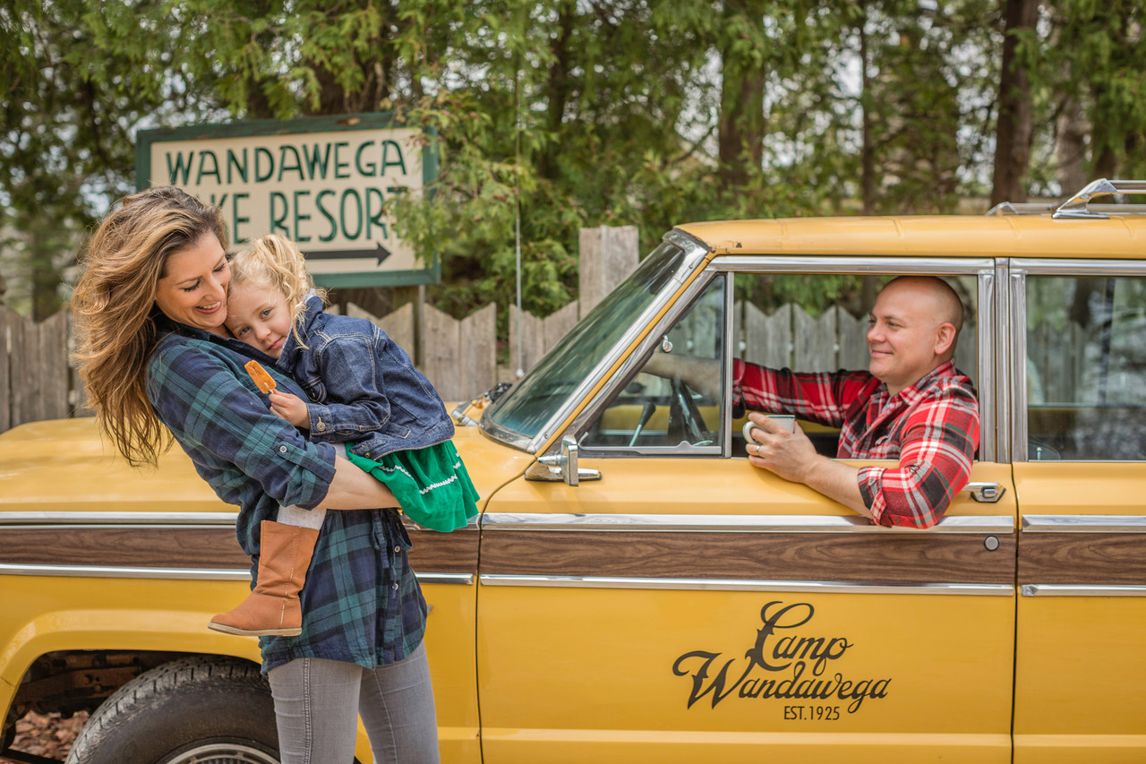
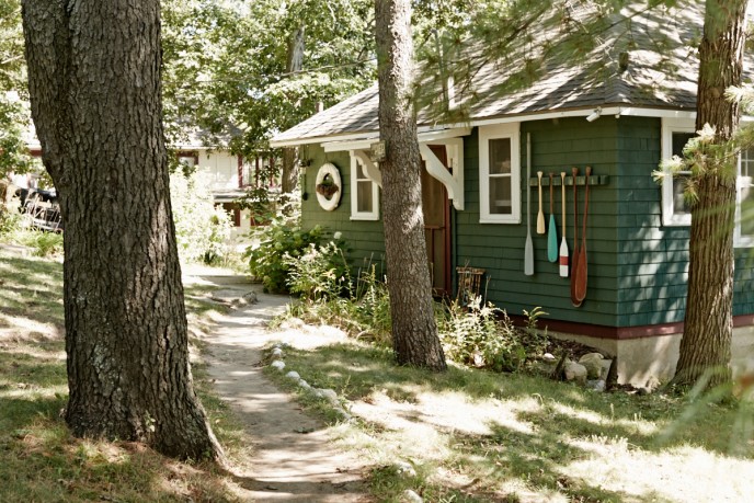
But the creative endeavor closest to Tereasa's heart is her work to save, renovate, and revitalize Camp Wandawega, the historic summer retreat in Walworth County, Wisconsin that Surratt operates together with her husband David Hernandez. Impeccably restored, endlessly Instagram-able, and ever evolving, through David and Tereasa's love and care, Camp Wandawega has become an essential destination for all manner of creative types passing through the Chicagoland area.

This year, we reached out to Tereasa and asked her to create a custom mood board featuring items that inspire her. Then we asked her to combine those items with the Hudson Company wood of her choice. Here's the story behind Tereasa's mood board.

5 Questions With Teresa Surratt

Tell us about the items included in your mood board, what's their origin story? Why did you select them for this mood board?

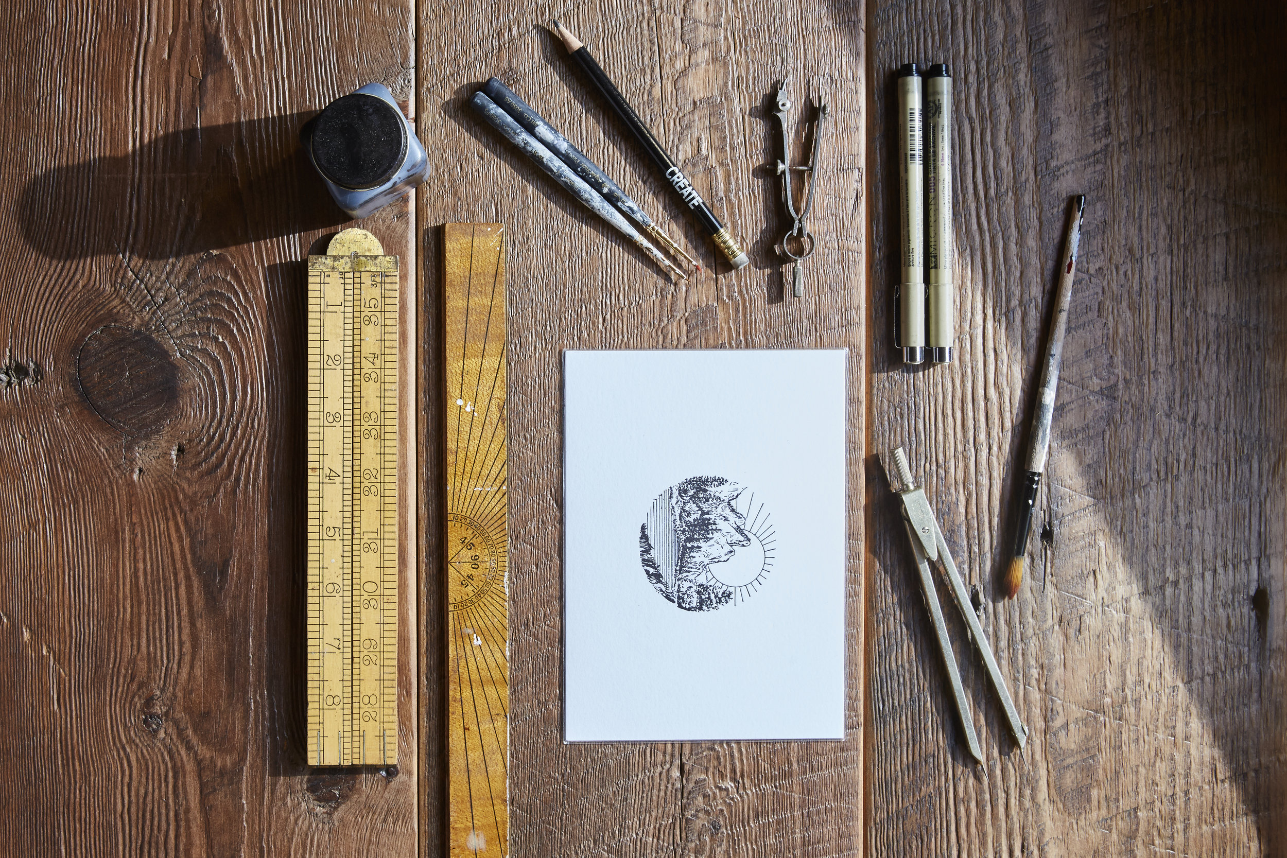
This is a collection of artifacts sourced from either our collection at Camp Wandawega, or things I discovered at area barn or estate sales. They are generally what I call 'history scraps,' items that were never intended to last forever. They're common kinds of things - postcards, handwritten notes, branded ash trays, mattress tags, a length of leather - these are objects that each served modest tasks. I'm more than a little obsessed with these kinds of little things, with their humble, utilitarian beauty and the way that they've survived the decades.

Are there any particular favorites that stand out or are especially endeared to you?

It's the little things that always get to me; like the color of the vintage, chewed up pencil in this mood board. This particular shade of ochre was really popular in the 1940s and could be found on everything from tractors to coffee cans. We are building a house at camp and are seriously considering creating a line of modern chairs in this vintage color. When juxtaposed with the new building's concrete floors and minimalist white interiors, the use of this color could be a subtle nod to a much different time in America's design history.

How do you use mood boards in your professional work? What role do they play in your creative process?

Whenever I'm working on a new project, I collect things subconsciously over the course of a few weeks. Eventually, my little inspirational piles evolve into something important, something that reveals meaningful textures, colors, and themes. I find that when I use this creative method, the result is always more authentic and more honest.

Where do you turn when you need fresh ideas or inspiration? 

Of course, there are a lot of gorgeous blogs out there that are full of inspiring content. But more often than not, I find myself drawn to real life, specifically to people's homes. There's something about the objects and art and materials in a living, working house that is just irresistible for me. Whether that's Thomas Edison's Winter Estate down in Fort Myers or the rugged, preserved homesteads at 'Old World Wisconsin' - I have always been drawn to the forms and functions of domestic life. Also, old 1960s issues of Architectural Digest, Better Homes & Gardens and vintage, out of print books are a great source for ideas and creative presidents.

Why did you choose Reclaimed Threshing Floor as the background for your mood board?

Everything we do at Camp is connected with history. Now that we're listed on the National Register of Historic Places, that's more true than ever before. So, to try and connect Camp artifacts with some glossy, mass produced floors just wouldn't work. With Reclaimed Threshing Floor, there is so much history right there in the wood grain. The fact that this flooring was (once upon a time) used by some farmer, somewhere, to separate his wheat and chaff - that's so rich.

Who could have imagined that when these floors were first crafted a hundred years ago, that they would live another life in a 21st-century home or museum? They have such an enduring quality. Like the objects I selected to lay over the planks, this flooring had humble beginnings. But over time, it's developed this kind of mysterious, timeless patina. This wood is a remnant from another time, and, yet, in it's own way, it's more intriguing than ever.

Special thanks to Tereasa Surratt and David Hernandez. You can learn more about Tereasa at her site. And you can learn more about Hudson Company Reclaimed Mixed Softwoods [Threshing Floor] here.