Installation In Focus: Sunnyfield Farm

Sunnyfields+2.jpg
Sunnyfields Option 2.jpg
Sunnyfields 4.jpg
Sunnyfields Option 1.jpg
Sunnyfields 5.jpg
Sunnyfields 1.jpg

A Classic Home 8 Years In The Making

Overlooking the rolling hills of the Hudson Valley is the idyllic Sunnyfield Farm, a horse farm and traditional Georgian-style home in Millbrook, New York.

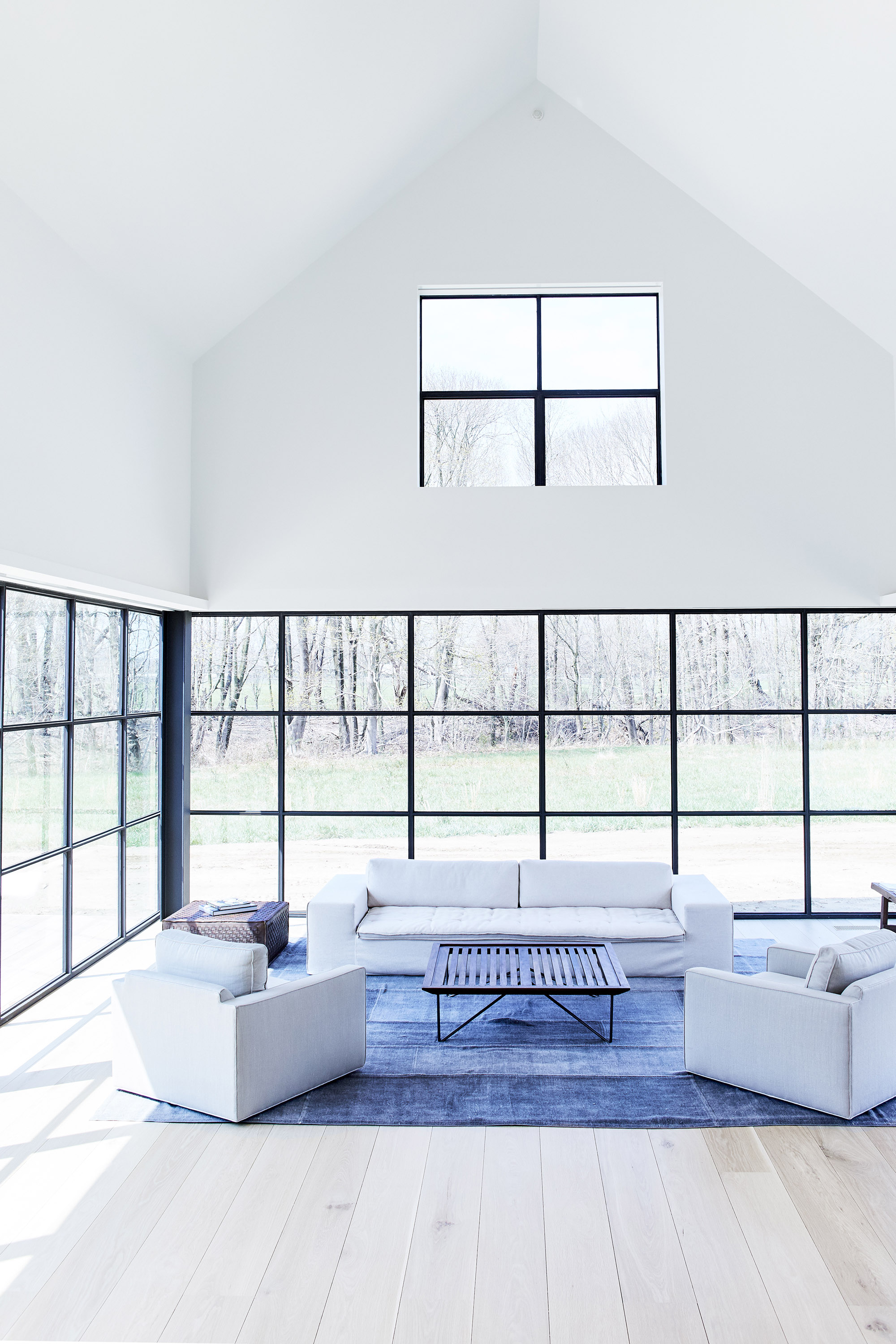
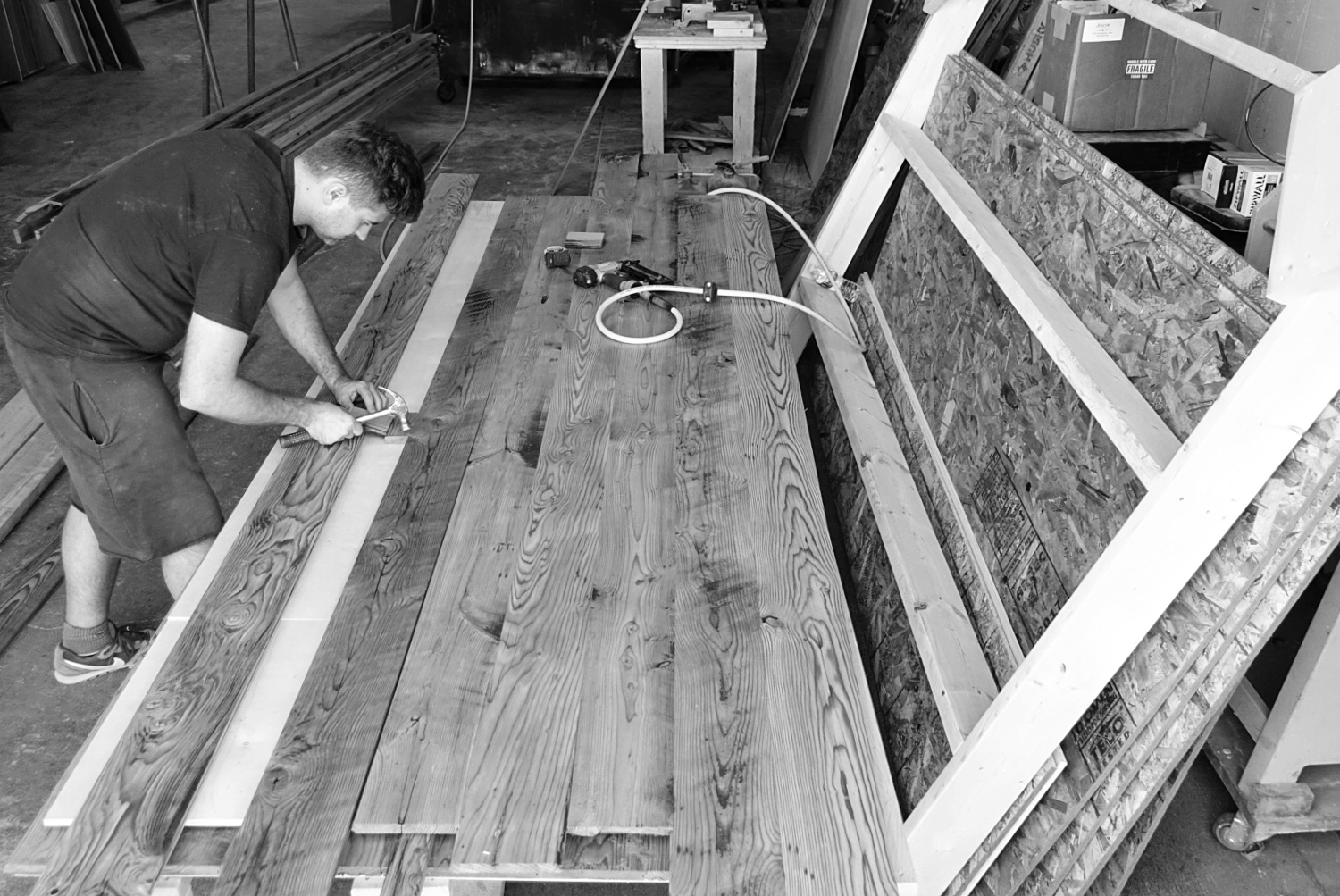
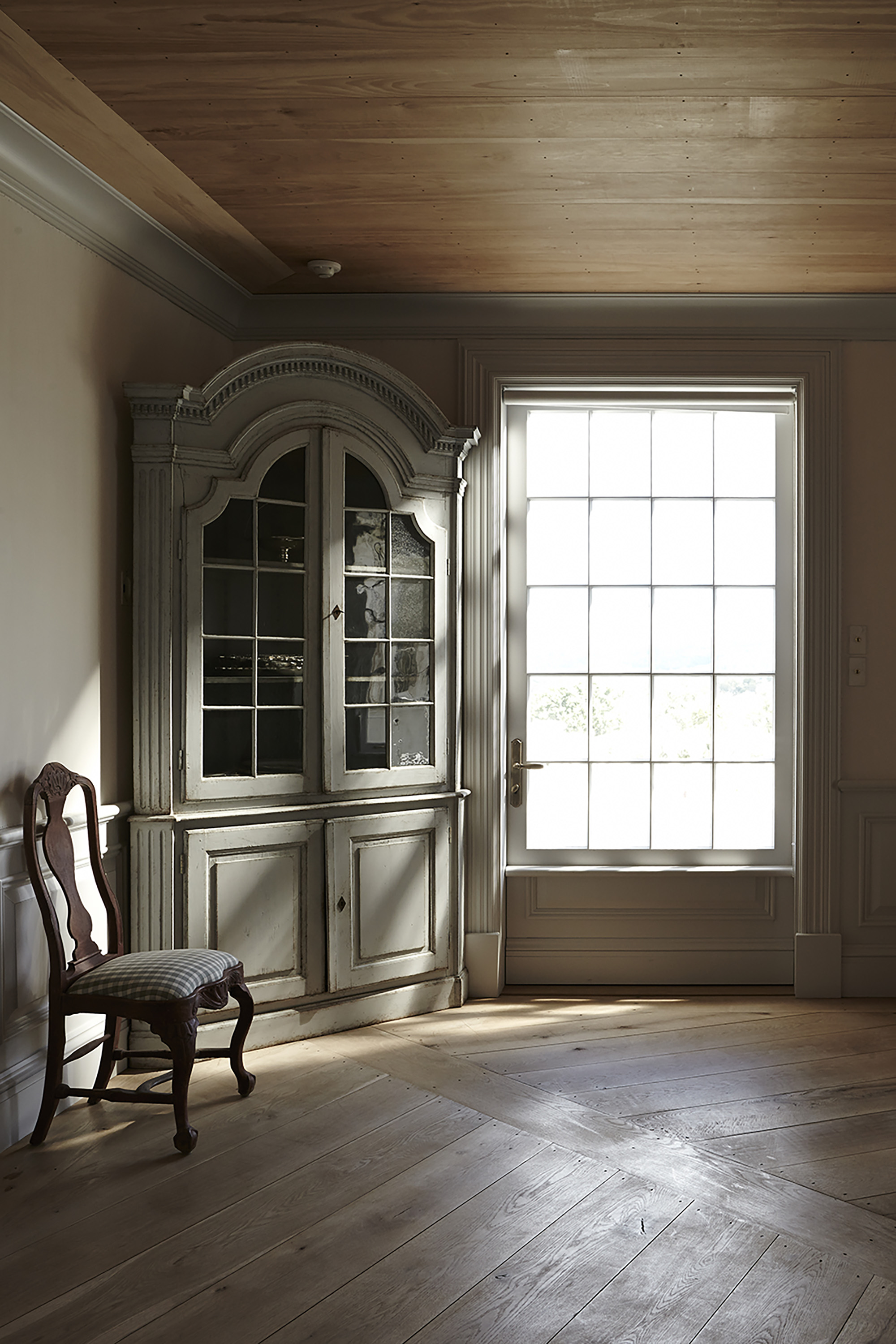
The Hudson Company was honored to play a role in the development, design, and construction of the home — a project spanning more than eight years, including a research trip to the Swedish countryside for inspiration and materials. This passion project required not only a very close client-designer relationship but also an ongoing dialogue with The Hudson Company. The result of these close partnerships is a residential installation project that features some of our most ambitious flooring details to date, including 10" Reclaimed Heart Pine flooring sourced from historic New York City townhouses; custom-milled, extra-long White Oak floor planks;  and Reclaimed Redwood specially milled for Sunnyfield’s trim work. 

Throughout the process, lead architect Cynthia Filkoff of Di Biase Filkoff Architects was attuned to her client’s high standard of quality and beauty. “We were initially asked to transform the preexisting modernist house into a traditional Tudor,” Filkoff explains, “but after living in the original house for a year, the client decided that the quality of the construction was inadequate. It made more sense to tear it down and build a new home.”

In time, the team at Di Biase Filkoff came up with a solution that would meet the client’s exacting criteria: a proper brick Georgian home with Swedish-inspired interiors connected to the magnificent land and views. In order to find the right balance of craftsmanship and aesthetic, Filkoff traveled to the client’s summer home in Fiskebäckskil, Sweden. “In Sweden, I was able to study the wood-centric, old-world architecture that the client admired so much. What I found there was an aesthetic that was rich in handcrafted details. It was inventive and playful, both inside and out. Ultimately, these were the kind of details that we worked to incorporate at Sunnyfield.”

Along with a detailed list of high-quality, sustainable material specifications, the choice of wood flooring was critical to the aesthetic and design of the home. “When it came to flooring,” Cynthia recalls, “the client was committed to creating a wood floor that reflected the antique floors of classic Swedish homes. The details had to be authentic.” From here, Di Biase Filkoff turned to The Hudson Company, who encouraged the designers to incorporate two complementary flooring types: Reclaimed Heart Pine and White Oak.

The Reclaimed Heart Pine milled for the Sunnyfield project was sourced from a row of historic townhouses on New York City’s Upper East Side and then milled to a width of 10” to reflect the flooring Filkoff had researched in Scandinavia. The White Oak flooring planks, installed in the home’s ground floor, were sourced from purpose-cut trees, hand selected from private timber stands. The trees were air-dried, kiln-dried, and custom milled to meet the architect’s designs. Along with an intricate wagon wheel pattern for Sunnyfield’s dining room, Filkoff also designated that much of the White Oak would be milled into extra-long planks that could span from the home’s front entrance all the way to the back door. At 10” wide and ranging from 10’ to 24’ in length, these extraordinarily long oak planks create a striking and unique aesthetic for the home’s ground floor. In addition, Reclaimed Redwood, sourced from decommissioned New York City rooftop water tanks, was used to outfit the home’s custom door and window frames and interior trim.

In the end, what made the Sunnyfield project such a glowing success was the sustained and passionate attention to detail by everyone involved: the client, the designers, and a wide array of talented craftspeople. Looking back, Filkoff remembers the project collaboration with special fondness. “Working with The Hudson Company exceeded our expectations on every level: from their knowledgeable insight and expertise, to their creative ideas, to their ability to source and deliver materials on time and on budget,” she says. “Throughout the project, the collaboration was exceptional. The Hudson Company enhanced the entire process. You know, I could go on and on about this project. Sunnyfield was such a labor of love.”

This installation profile originally appeared in The Hudson Company Journal, Volume 2 - click to learn more about our new print journal and catalogue.

Installation In Focus: Willow Street

Willow Street 2.jpg
Willow Street 3.jpg
We wanted the space to be a balance of contrasts, open and airy yet respectful of the rooms expected in townhouse living; modern lines and materials, but respecting the character of the house and neighborhood; natural but polished; unique and creative, yet timeless and universal.
— Damian Zunino, Studio DB
Willow Street 4.jpg
Willow Street 1.jpg

Transformation In Brooklyn Heights

Well known for its tree-lined streets and well-preserved antebellum townhouses, Brooklyn Heights is one of New York City’s most charming neighborhoods. At the very heart of this historic district is the 1834 brownstone on the corner of Willow and Middagh Street. Originally built in a Greek Revival Style, 15 Willow once belonged to the Franciscan Sisters of the Poor but, in 2016, was transformed into a single-family residence — a transformation that required a nuanced balance of innovation and preservation. The development and design team behind the renovation at 15 Willow Street project was Studio DB, led by the firm’s husband-and-wife principals Damian and Britt Zunino.

Damian explains how, as the team endeavored to modernize the 6,400-square-foot, five-bedroom townhouse, their goal was to create a balance of contrasts. “We wanted the space to be open and airy, yet respectful of the kind of interiors expected in townhouse living, [with] modern lines and materials that honored the historic character of both the house and the neighborhood.”

The choice of flooring was central to the architects’ goal of honoring the past while simultaneously integrating modern lines and materials. “We had a vision of how we wanted the floors to feel, so we reached out to The Hudson Company at the very beginning of the process. There was a specific walnut floor we were looking for — we wanted something that felt natural but still had a lot of character, and we knew The Hudson Company could produce this kind of flooring for us.”

Through close collaboration with the Studio DB team, The Hudson Company custom-milled 3,000 square feet of 5” Walnut plank and 1,000 square feet of 5” Herringbone plank for the project.“The new floors feel light but still raw,” Zunino says. “The finish brings a timeless, polished aesthetic to the house’s interior.”

The installation profile originally appeared in The Hudson Company Journal, Volume 2. Read more or learn how to get your physical copy of The Journal here.

IMG_4291.hud.co.journal.jpg

Inspired By: LAND

brand-specimens__land-rhodes-everitt__150520_191159_65210E84A986520E5CFCC7A097.jpg
brand-specimens__land-rhodes-everitt__150520_161157_770DDEE02B3FC53045F3FF9EBF.jpg
brand-specimens__land-rhodes-everitt__150520_161711_64A190A88BF342C0564F194FF5.jpg
Screen Shot 2017-11-17 at 11.57.40 AM.png
Screen Shot 2017-11-17 at 11.56.28 AM.png
LAND artists and designers Caleb Owen Everitt and Ryan Rhodes.

LAND artists and designers Caleb Owen Everitt and Ryan Rhodes.

LAND: Transcending Style and time

Austin, Texas based design studio LAND is a hard act to categorize.

A team that clearly thrives on rethinking what it means to be a 'designer' in the 21st century, LAND creates a unique body of work in a wide variety of medias - from hand-drawn graphics, to linocut prints, to textiles and metalwork, brand campaigns for both digital and print, and, now, LAND even has their own line of limited-edition clothing.

In their own words, LAND is, "[A] house of art, design and thought: a collaboration between American artists and designers, Caleb Owen Everitt and Ryan Rhodes. Through an exploration of typography, iconography, and arrangement of materials, we demonstrate a way of working that transcends a style or time with regard to the art of communication."

Honesty through Imperfection

What inspires us most about this dynamic design duo is their collaborative process and their strong emphasis on how the imperfections of handmade art can bring an honesty and originality to modern graphic design and branding.

Caleb and Ryan have described art as the main source of their inspiration, with their 'sweet spot' being the process of blurring art with design to bring 'feeling' into each of their projects.  When asked about the difference between 'art' and 'design,' the LAND creatives have developed an answer that is both simple and profound, 'art is selfish, design is accommodating.' 

Reclaiming The Past, Always Moving Forward

In an interview with Urban Outfitters, LAND described their process of looking to the past for inspiration in their work: "Most of the type we create is hand done or inspired by historical typography. From old books and signs to hobo scribbles, type that was created by a hand or a machine just feels better than a more modern, digital font. It's more fun to create something custom, or that feels like it came from a real place before you and I were born and will be here after we're dead."

Past LAND Clients Include: Ace Hotel, Deus Ex Machina, Falcon Motorcycles, Levi's, Monster Children, Nike, Patagonia, Poler, Stag Provisions, West America, Woolrich. You can see a longer list here.

Special thanks to LAND for the use of their imagery. All art and design work is the (C) property of www.workbyland.com. Used here with permission.

279_121120_121056_patagonia.jpg
284_121120_040025_patagonia.jpg
static1.squarespace.jpg
tumblr_ng5o4fm0pp1u02s8lo1_500.jpg
brand-specimens__land-rhodes-everitt__150522_125426_3C6F00398CC89AC4C0074C8F32.jpg
At work in the LAND Studio. Photo by Chelsea Fullerton for Urban Outfitters.

At work in the LAND Studio. Photo by Chelsea Fullerton for Urban Outfitters.

At work in the LAND studio, Austin, Texas. Photo by Bill Sallans.

At work in the LAND studio, Austin, Texas. Photo by Bill Sallans.

At work in the LAND studio, Austin, Texas. Photo by Bill Sallans.

At work in the LAND studio, Austin, Texas. Photo by Bill Sallans.

Taking a break in the LAND studio, Austin, Texas. Photo by Bill Sallans.

Taking a break in the LAND studio, Austin, Texas. Photo by Bill Sallans.

Installation In Focus: Mitchell's Lane

Kevin+O'Sullivan+Associates.jpg

Flat Sawn White Oak Floors At Mitchell's Lane Residence

Our custom Flat Sawn White Oak is milled to minimize waste and to accentuate arching, cathedral grain. This cut includes edge sap, tight knots, and grain variation. Learn more about this versatile flooring product here.

Photos above and below are from the award winning Mitchell's Lane residential installation (also known as 'Grove House'), designed by Roger Ferris + Partners. A few notes about the project design, taken from the architect's website:

This private residence was designed as an immersive yet modern natural retreat, providing connections to the surrounding landscape via planes of glass that interrupt a series of solid forms. Two of the volumes are delicately connected and sectioned off by a glass breezeway, housing the public and private living spaces of the home. A third volume stands alone, housing an artist studio on the second floor overlooking the rural landscape on which the home is set. Each of the three simple gable-shaped volumes are covered in the same natural rain screen wood material, that will gradually weather as the volumes fade into their natural surroundings.

Learn more about our Flat Sawn White Oak  here and see more from this design installation here.
 

Mitchells Lane Kitchen.jpg
MITCHELLS LANE 5.jpg
MITCHELLS LANE 1.jpg
MITCHELLS LANE 4.jpg

Introducing The Hudson Company Journal, Vol 2

Introducing the All New Hudson Company Journal, Volume 2

The new issue of The Hudson Company Journal  celebrates the people, products, and projects at the heart of who we are, goes behind the scenes at our mill in upstate New York, and takes an in-depth look at the best of our design installations, including our floors for the new Whitney Museum of American Art.

The Hudson Company Journal, Vol 2 is a tool to help designers and homeowners envision ways to use custom wood flooring, paneling and beams in your next design project.

Stop by our ManhattanBrooklyn, or Pine Plains Showroom to pick up your copy of The Hudson Company Journal Volume 2.


*Read A Digital Version of The Journal Here*

Event Stage For Field + Supply 2017

FRONT ROW.jpg
BACK STAGE.jpg

The Hudson Company + Field + Supply 2017

Over the past few months, we had the pleasure of collaborating with designer Brad Ford to craft the event stage for the 4th annual Field + Supply, which took place at The Hutton Brickyards in Kingston, NY from October 6-8. 

Over the Columbus Day weekend, the Field + Supply event stage played host to a number of talented artists, including: Brooklyn Bluegrass Collective, Cricket Tell The Weather, and The Bones of JR Jones among others. You can see the full list of performers here. 

This year's stage was being built with Reclaimed Mushroom Wood paneling. Our Reclaimed Mushroom Wood paneling is sourced from the bedding bins of mushroom growing facilities in the mid-Atlantic. The material offers a caramel patina and a combination of smooth and radial kerfed faces.

Interested in stage or installation design? Click here to see our 2016 stage for Field + Supply. 

Special thanks to Cabinets by Stanley and designer Brad Ford.

Stage photos by Alex Nawrocky.

HERO STAGE.jpg
STAGE MAIN.jpg
Stage Side.jpg
STAGE DETAIL.jpg

Inspired By: Plethora Magazine

Plethora_Magazine_Issue_5_side_1.jpg
 
 
We wanted to highlight the natural beauty and tactility of print by using a format that allowed the craftsmanship to shine trough on an excessive level. Ultimately, we created this kind of otherworldly giant…an object that no one would know exactly what to do with.
'Anima Mundi:' the latest issues of large format (70cm by 50cm), bi-annual Plethora Magazine, created and published by  Peter Steffensen and Benjamin Wernery.

'Anima Mundi:' the latest issues of large format (70cm by 50cm), bi-annual Plethora Magazine, created and published by  Peter Steffensen and Benjamin Wernery.

8.jpg
35.jpg
_MG_5174.jpg

An otherworldly Giant

Plethora Magazine is an independent, biannual publication founded in Copenhagen which challenges the bounds of the conventional magazine format — conceptually as well as physically (each page has poster dimensions, 50cm x 70cm). 

Skillfully printed by the monks of a Hindu temple, Plethora Magazine is unlike any other magazine on the planet: no noise, no ads and no logos, just 52 pages of poster-size visual indulgence and tales from the life less ordinary, presented in a careful blend of quirky archive material, wondrous art prints and contemporary artist features.

What inspires us most about Plethora, is how editor Peter Steffensen and art director Benjamin Wernery are curating such a fascinating variety of content - much of it reclaimed from historical ideas, technology, and imagery - to make something entirely new. 

Here are the highlights from our conversation with Peter Steffensen.

First off, tell us about the creative / professional journey that led you to Plethora?

I come from a background in philosophy and so, in  many ways, Plethora is a natural bridge for me between the academic world and the art scene. With Plethora, we are trying to shift the boundaries between the two fields and create a new context for both, essentially blurring the lines between fiction, myth, and science - which I think is an essential aspect of art. 

Was there one main idea that led to creating an oversized magazine now, in the digital age?

Yes, in fact. As you probably know, not that long ago, most magazines published a digital version to supplement their print publication. But now, that relationship has been been inverted. So, the aim for us was to turn all the inherent and presumed 'flaws of print' upside down and then amplify and refine them to a degree were they became attributes, specifically those qualities that are impossible to digitize.

Basically, we wanted to highlight the natural beauty and tactility of print by using a format that allowed the craftsmanship to shine trough on an excessive level. Ultimately, we created this kind of otherworldly giant…an object that no one would know exactly what to do with.

Why did you believe that bigger was better?

Well, we wanted to craft a very particular reading experience. The magazine's size naturally slows down the consumption of content.  Plethora Magazine is designed to actively involve the body so as to change the way we experience the content and then, hopefully, open up a space for reflection.

What we've observed is that the magazine's size does, in fact,  help people to both slow down and become quieter as they flip through and examine the pages - which is one of the hardest things for any of us to achieve these days.

Without giving away any trade secrets, what can you tell us about the printing process?

We are fortunate to work with very skillful printers here in Denmark called Narayana Ashrama Press, which is both a Hindu temple and a high end off-set printers. It’s truly a wonderful place and so, when we print, we actually move in and stay at their guest house during the whole process. This lends a much needed air on calm to an otherwise decision-intensive and hectic process. Don’t think we could make Plethora anywhere else.

what would you say is the 'red thread' that connects the themes of all six issues of Plethora to date? 

We work from a vast and ever-evolving archive of images and subject matter that we have compiled over the years (the crossroads between art and science is definitely a preferred territory for us). And these items make up the reservoir from which we can shape and slowly built a theme for each issue. Honestly,  the themes for some  editions can be years in the making. 

Ultimately, the trick is to create subtle intersections between a variety of narratives in order to bring about the element of wonder, which is essential to Plethora.  We want to create a experience where layers of meaning are endlessly unfolding, so there are new connections being made each time you open an issue. 

What's been the biggest challenge in bringing Plethora out into the world?

Almost from day one we’ve had to carve out our own niche within the world of magazine distribution. Also because it’s such a hybrid between a curated print collection, an object d’art, and a conventional magazine. So seeking out the appropriate platforms and outlets for the magazine has probably been the biggest challenge.

Do you have a favorite feature from the first six issue of Plethora?

Once in a while we manage to stumble on a real gem. And if I was to pick one out of the lot, it would probably have to be the feature on the Selknam tribe of Terra del Fuego (also called the Hain people), from our first issue (see below).

During the long preparation for issue one, we ran across these amazing black and white images of a now extinct tribal culture. They were all wearing these strange tribal masks and their bodies were totally painted and they were standing out in the snow. The whole scene was like something out of a strange and grotesque avant-garde theater productions. 

When we researched the Hain we discovered an incredible and elaborate mythology behind the initiation ritual - more complex than any greek tragedy. 

As it turned out the image we found were taken by a German priest and anthropologist who visited Patagonia in 1923 and who happened to witness and document,  the last ever initiation rite of the Selknam tribe. The entire tribe were murdered by settlers not long after the priest's visit.

So this story just had it all - fierce drama, mystery, forgotten meaning, archetypical signs and symbols - an ancient, universal narrative somehow. Working with this story really helped set the tone and standard for how we choose our features ever since.

What can you tell us about the impact Plethora is having around the world?

Only when an issue of Plethora is exhibited and unfolded in three dimensional space, can the potential of the magazine truly comes across, and the quality of the print can be best appreciated. 

So, from the very beginning we have prioritized traveling exhibitions abroad to show the diversity of our editions and to create experiences for a foreign audience that would have a real impact. And it gives us the opportunity to meet with our collectors in person, which I think is very important for our kind of product.

How would you say that ideas and artifacts, of the past inspire you to create and innovate?

I really appreciate the different traditional crafts that we encounter on our journeys. Especially in Asia, where the artisans have a very different approach to time and craft than we have here in Scandinavia. All in all, I like most esoteric things drenched in mystery and symbols. And much of the work we do on Plethora Magazine is actually one long semiotic journey to extract the meaning behind these.

So, for now, I definitely feel that I'm in the right line of work.

Learn more and shop at www.plethoramag.com

The Selknam tribe of Terra del Fuego from the first issue of Plethora Magazine.

The Selknam tribe of Terra del Fuego from the first issue of Plethora Magazine.

Peter Steffensen, Editor In Chief (pictured at right) and Art Director  Benjamin Wernery of Plethora Magazine.

Peter Steffensen, Editor In Chief (pictured at right) and Art Director  Benjamin Wernery of Plethora Magazine.

The aim for us was to turn all the inherent and presumed ‘flaws of print’ upside down and then amplify and refine them to a degree were they became attributes, specifically those qualities that are impossible to digitize.
— Editor-In-Chief, Peter Steffensen
Plethora_Magazine_Issue_6_SWARM_01-kopier.jpg
19.jpg

Sneak Peek: Our Stage for Field + Supply 2017

IMG_6363.JPG

Sneak Peek at Our Reclaimed Mushroom Wood, Event Stage for Field + Supply 2017

We are just a couple of days away from the kickoff of Fields + Supply 2017 at The Hutton Brickyards in Kingston, New York. Like last year, The Hudson Company is proud to, once again, collaborate with designer Brad Ford on the Field + Supply event stage.

This year's stage is being built with Reclaimed Mushroom Wood paneling. Our Reclaimed Mushroom Wood paneling is sourced from the bedding bins of mushroom growing facilities in the mid-Atlantic. The material offers a caramel patina and a combination of smooth and radial kerfed faces.

Stay tuned to The Hudson Company Instagram for the reveal of this year's event stage this Friday, October 6th, on the opening day Field + Supply 2017.

Special thanks to Cabinets by Stanley and designer Brad Ford.

IMG_6352.JPG
IMG_6357.JPG
IMG_6349.JPG
IMG_6370.JPG
IMG_6368.JPG
IMG_6353.JPG

Join us for Field + Supply 2017 At The Hutton Brickyards in Kingston, NY

FS Edit.jpg

Field + Supply, October 6-8, 2017

We are now less than a week away from one of our favorite annual design events: Field + Supply Modern Makers Fair founded by designer Brad Ford.

Join us this weekend Oct 6-8, at The Hutton Brickyards for a one-of-a-kind gathering of artists, makers, designers, and craft food exhibitors. Exhibitors for at this year's F+S include: Dzierlenga FurnitureJ.M. Szymanski Interiors, Michele Quan, Jim Zivic, Borough Furnace, Made By Hand-Jon Giswold, Fayce Textiles, Adler & Co., and many many others.

Learn more about Field + Supply and book your tickets here.


From The Archives: The Hudson Company Stage for Field + Supply 2016

While we wait to reveal this year's The Hudson Company + Field + Supply 2017 events stage design, we invite you to dive into the archives to see our how last year's stage collaboration with designer Brad Ford came to life. 

Stay tuned to this blog and to our Instagram Feed for the reveal of this year's Field + Supply stage...

Inspired By: Selina van der Geest of NL-GB

SEVAN029 (1).jpg
SEVAN015 (1).jpg
The Reclaimed Brown Board Paneling we used on the outside of our house immediately adds a sense of history and character.
— Selina van der Geest
Selina van der Geest of NL-GB, photo by Venetia Dearden

Selina van der Geest of NL-GB, photo by Venetia Dearden

Introducing Selina van der Geest

Interior designer Selina van der Geest moved to New York from London in 2000. Since coming to America, Selina has worked in the art and decorating business and has now opened her own eclectic showroom near Millbrook, NY, 90 miles north of New York City.

After building her own house in Milan, New York, Selina was inundated with requests to add her unique style and organizational skills to projects for private clients. It has been a natural progression to continue the decorating business she started back in England, bringing a relaxed European feeling to her clients’ houses. She believes in working organically, reflecting in her designs and colors, the natural surroundings of the property she is transforming.

Earlier this year, we sat down with Selina to discuss her work.

Tell us a bit about how your time training in Europe prepared you for the work you do today?

Well, I studied history and art history which gave me a great background for my work in interior design.  I was lucky to combine both fields working for Colnaghi, the old master art gallery in London, designing stands and galleries as well as working with important art works. It was there that I learned woodworking and curtain making, thus giving me a very hands on approach to my work. The European aesthetic is different and has certainly continues to influence my work here in the States.

How did you choose Upstate, New York as the base for your home and business?  

My husband, who is Dutch, bought a house Upstate in 1983, when he first came to America.  I moved to New York from London in 2000 and since I share his love for the area, we purchased land in 2002 and decided to build a house. As soon as we finished the house, I was asked to help with other projects and so my work Upstate evolved.

what is the red thread that connects all of your design interests?

I am very inspired by nature and the environment around me, whether Upstate or on my travels. I often  incorporate natural elements into my designs.  Bottom line, I strive to create original homes and furniture for my clients and that's what drives me creatively.

What can you tell us about the design process for your own home in Milan, NY?

Before even buying the land, we bought an early 17th Century Louis XIII mantle in Bordeaux, France when we were there for a wedding.  Then, we designed the house around this and a pair of antique Chinese doors.  Coming from homes built of stone in England, I wanted to achieve the same sense of history and character in our new home Milan.

The Reclaimed Brown Board Paneling we used on the outside of our house, immediately adds a sense of history and character.  I stained the cut edge of all the batons, so we didn’t have fresh cuts showing.  It also has the advantage of requiring less maintenance.

Inside we have a large open room featuring Reclaimed Hudson Company Beams, which, along with the Bordeaux mantlepiece, give a very European character to the house.  On the floors we used wide white oak boards, which we left untreated so they could develop a patina over time.  The result is a home which feels very settled, relaxed and natural.

What were some of the key design goals for your new home?

We love cooking so wanted to have a big open space that would allow us to cook while also enjoying the fire and the living area.  You enter through a mudroom with the large Chinese doors creating a welcoming opening into the great room and a view through the French doors to the pool beyond. We often have our family and guests staying and having separate bedroom wings and a guest apartment help to give us all space, but a wonderful place to congregate.

We built the house in seven months and it was certainly an advantage to be on site daily. I spent many days shoveling snow or helping the framer when someone didn’t show up and nothing was delayed waiting for decisions.  I also insist on a clean and tidy job site, believing that a messy environment encourages sloppy work.

What's next for Selina van der Geest?

I am working on a new house being built in Sharon, CT for a client whose apartment I designed in the city. We’re combining a traditional stone farmhouse with painted barn buildings, a stone potting shed and an English green house. The goal is for the house to feel as if it’s been there for hundreds of years and has evolved over time.  Likewise, my goal is for the interior is to feel as if it’s been collected over the years, with interesting accents, textures and natural colors.

Lastly, how would you describe your experience working with The Hudson Company?

The Hudson Company have a wonderful selection of materials and a great aesthetic. From the sampling process to selection, they have listened and understood what we are after. Whether its a small order of individual planks and beams or a bigger order of  pre-finished wood floors, The Hudson Company has  always provided us with quality, professional services.

Visit NLGB.com to learn more about Selina's work.

Learn more about Reclaimed Hand Hewn Beams here and Reclaimed Brown Board Paneling here.

Below is a sampling of more interiors by Selina, with photos by Jane Beiles for The New York Times.

unnamed (8).jpg
unnamed (5).jpg
The Hudson Company have a wonderful selection of materials and a great aesthetic. From the sampling process to selection, they have listened and understood what we are after.
— selina van der geest
unnamed (3).jpg